Kyoorius + 3
Case Study

Zee Zest

Zee Entertainment
Scroll
Discipline
Channel Branding · Brand Identity
Client
Zee TV / Zee Entertainment
Scope
Strategy · Identity · On-Air Package · Sonic Branding
The Brief
Zee group wanted to launch a new channel with four distinct content verticals — Food, Travel, Wellness and Home Decor. In the midst of the pandemic, when nobody could travel or experience different cultures, this channel needed to lift spirits and connect to the audience through a peppering of good content. The challenge: one brand identity that works for four completely different worlds.
Launch Result
#1 Lifestyle Channel in India within 5 weeks of launch
Digital Impact
52 Million digital impressions at launch
Recognition
Kyoorius Design Awards 2021 — Multiple categories
Kyoorius Design Award
01
Addressing the four main content buckets for the viewer was solved by creating a dynamic brand identity — representing each vertical distinctly, yet under the same brand umbrella.
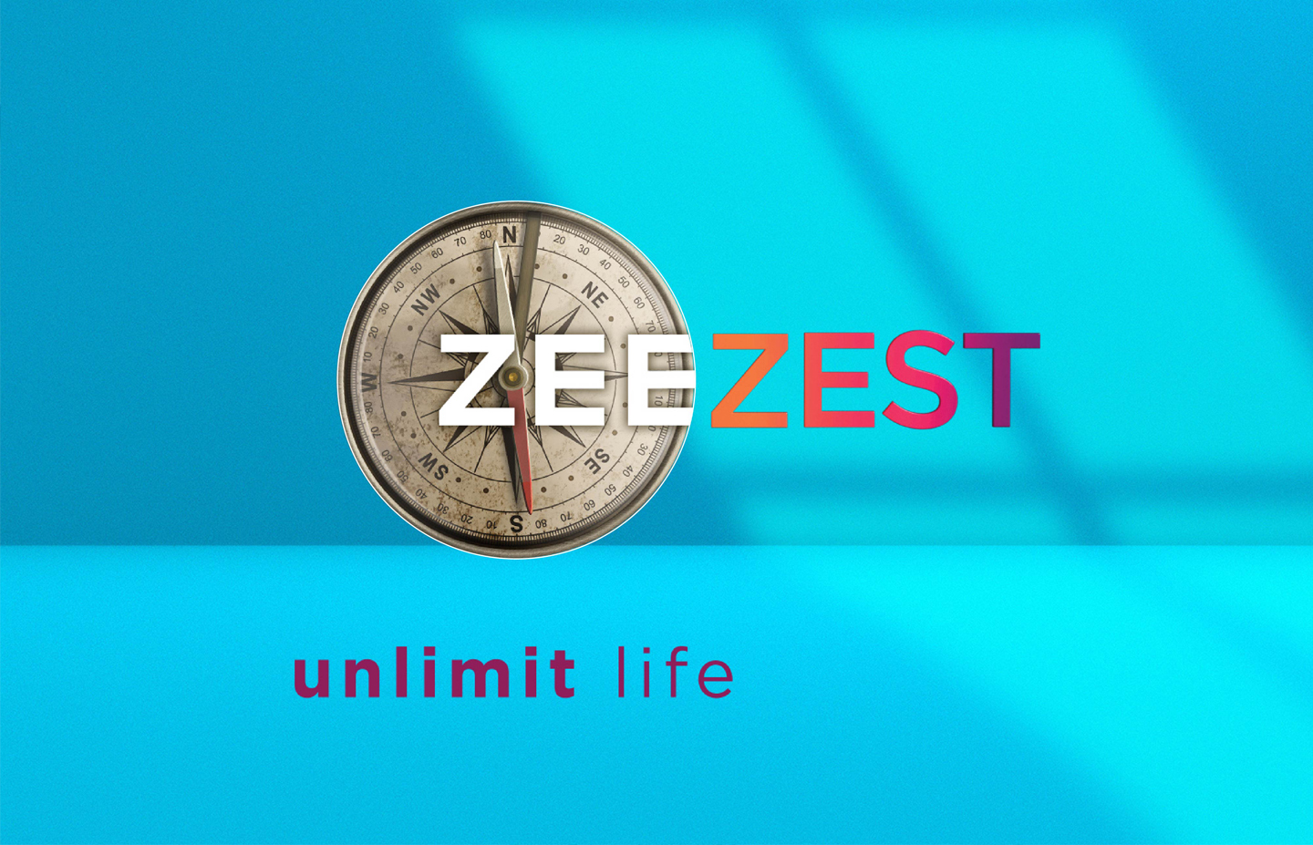
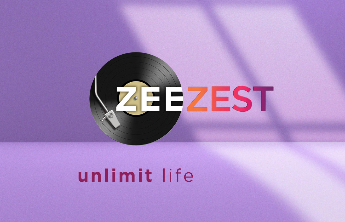
The brief demanded something rare in channel branding — a flexible identity system. Not a single logo, but a logo system. For the first time in India, a channel used a logo system with four different logo renditions — one for each of the four verticals of the channel. Food, Travel, Wellness and Home Decor each had their own identity expression, while remaining unmistakably Zee Zest. This was the foundational strategic and design decision that made everything else possible.
Zee Zest for Zee Entertainment — Hyphen Brands case study
02
The idea of 'zesting' — adding a zing with small bits of refreshment in content — was brought to life in the on-air package and promos.
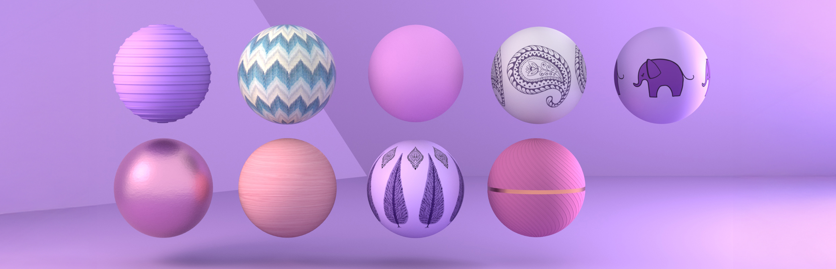
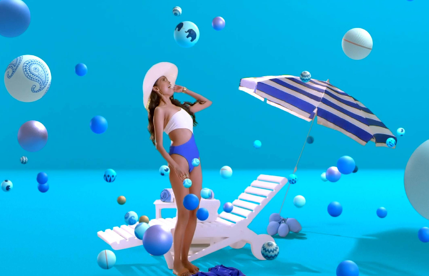
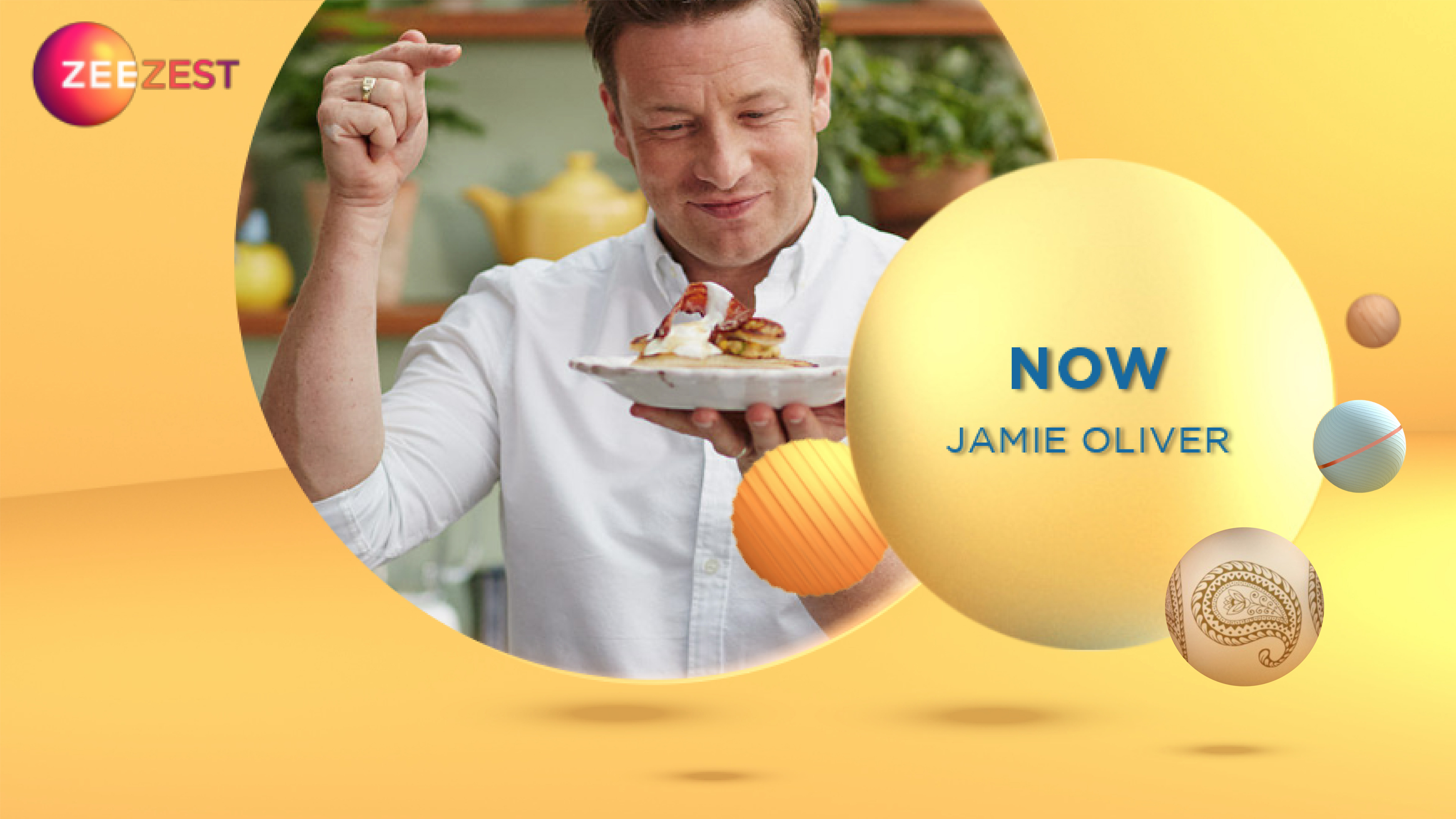
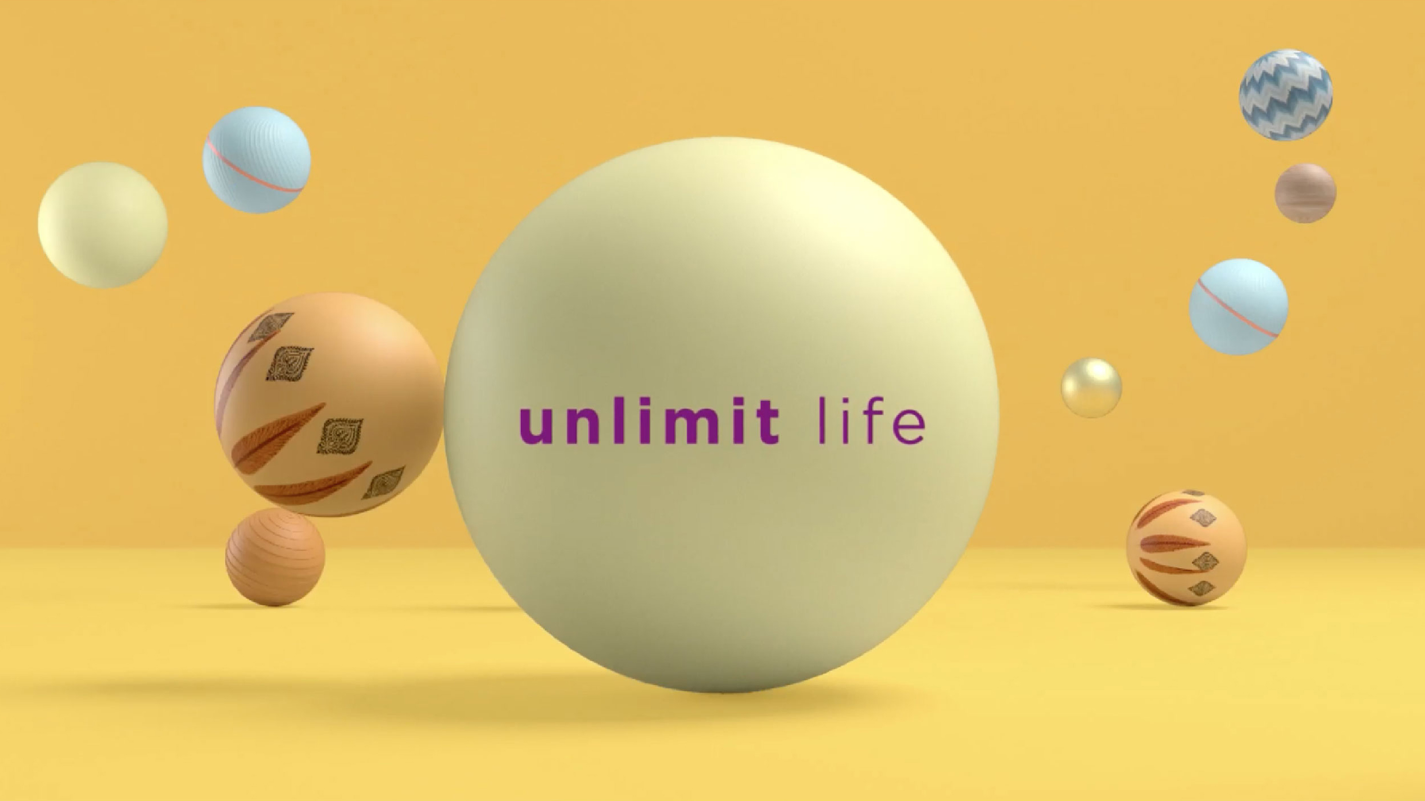
Zesting means to sprinkle in small bits and spike with flavour. This exact visual idea was taken for the entire channel identity — including idents and graphic promo kit. Tiny zest particles were depicted in a design palette of spheres in different modern materials, some embellished with Indian iconography. The communication idea of being unstatic was captured by the bouncing spheres, which always led to a happy surprise in the idents — and also revealed the channel logo.
Zee Zest for Zee Entertainment — Hyphen Brands case study
03
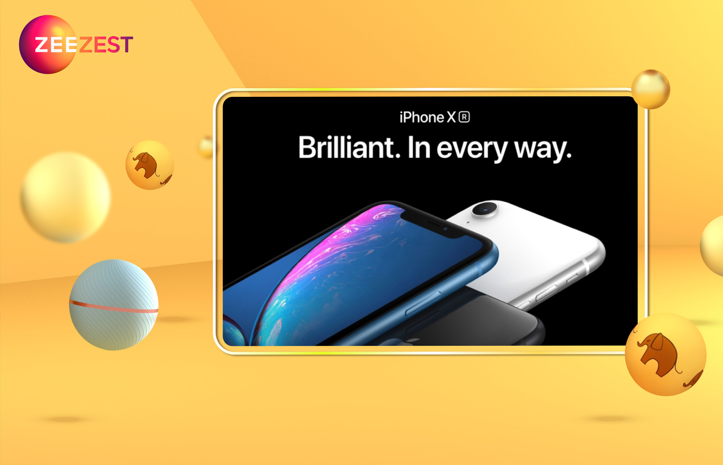
The on-air promos communicated a delightful surprise in their respective situations and settings.
Each of the four verticals had its own promo language — rooted in the same bouncing sphere system but expressed in the vocabulary of its own world. Food promos felt warm and appetising. Travel promos felt adventurous and expansive. Wellness promos felt calm and restorative. Home Decor promos felt aspirational and beautiful. The identity system held all four together without flattening any of them.
Zee Zest for Zee Entertainment — Hyphen Brands case study
04
The result — 52 million digital impressions, and the #1 lifestyle channel in India within five weeks of launch.
What began as a design brief became a landmark moment in Indian channel branding. Zee Zest launched into a pandemic-locked world and gave its audience a window to everything they were missing — food they couldn't eat at restaurants, travel they couldn't do, wellness rituals they'd abandoned. The identity perfectly mirrored this promise. The channel received 52 million digital impressions with its new identity and became the number one lifestyle channel in India within five weeks of launch.
Zee Zest for Zee Entertainment — Hyphen Brands case study

Zee group wanted to launch a new channel with four verticals — Food, Travel, Wellness and Home Decor. In the midst of the pandemic when nobody could travel or experience different cultures, this channel with its peppering of good content was able to lift up spirits and connect to the audience.

Zesting means to sprinkle in small bits and spike with flavour. This exact visual idea was taken for the entire channel identity including idents and graphic promo kit. Tiny zest particles were depicted in a design palette of spheres in different modern materials, some embellished with Indian iconography.

The communication idea of being unstatic was captured by the bouncing spheres which always led to a happy surprise in the idents — and also revealed the channel logo.

For the first time in India, a channel used a logo system with four different logo renditions for the four verticals of the channel.

The channel received 52 million digital impressions with its new identity and became the number one lifestyle channel within five weeks of launch.

Next Project
Mufti
Ready to build an
extraordinary brand?
Brief Us →