Case Study

Mufti

Mufti Jeans
Scroll
Discipline
Brand Identity · Logo Design · Space Design
Client
Mufti / Kamal Khushlani
Scope
Brand DNA · Identity · Logo · Retail Design
The Brief
Mufti — pronounced 'mafti' — an indigenously grown Indian fashion apparel brand, wanted to articulate its DNA and refresh its brand identity after two decades. Celebrating their 20th successful year in the Indian fashion landscape, they wanted to infuse a new vitality amongst their next generation of users.
Scope
Brand DNA · Logo · Retail Design · Digital Identity System
Recognition
Kyoorius Design Awards 2021 — Brand Identity
Kyoorius
Legacy
20 years of Mufti — reimagined for the next generation
01
Mumbai has always been the design muse for Mufti. So we decided to get inspired by the city in the brand identity itself.
Some of the great fashion brands of the world are an homage to their birth cities. Such is the strong creative influence of Mumbai over Mufti that the founder has deep-dived into the cultural nuances of the city's pockets for various design directions over two decades. We decided to celebrate this fact and proudly show our affection for the city in the entire brand story — not as a tagline, but as the foundational identity itself.
Mufti — Hyphen Brands case study
02
The inclusive nature of Mumbai — welcoming different people and languages — was demonstrated as the graphic form of Devanagari script cleverly mimicking the English M.
As coincidence would have it, Mufti and Mumbai start with the same alphabet. We decided to use this to our advantage. Over various design iterations we created a graphic form that represented the Devanagari script 'म' at one angle and at another angle looked unmistakably like an English M. This inclusion of multiple scripts and multiple languages in its visual symbol helped the brand connect with the next generation audience — urban, multilingual, proudly Indian.
Mufti — Hyphen Brands case study
03
The form also subliminally persuaded the viewer into seeing one of two things — a flying bird, or a zigzagging line. Never easy to access. Always rewarding.
This dynamic, contrasting and hypnotic play in pattern was not accidental but curated very purposefully — to foster a sense of occasion for the retail spaces as well as eye-catching digital in the form of GIFs and animations. The icon also represented the soaring of a bird, giving the brand its tagline: Airborne since 1998.
Mufti — Hyphen Brands case study
04
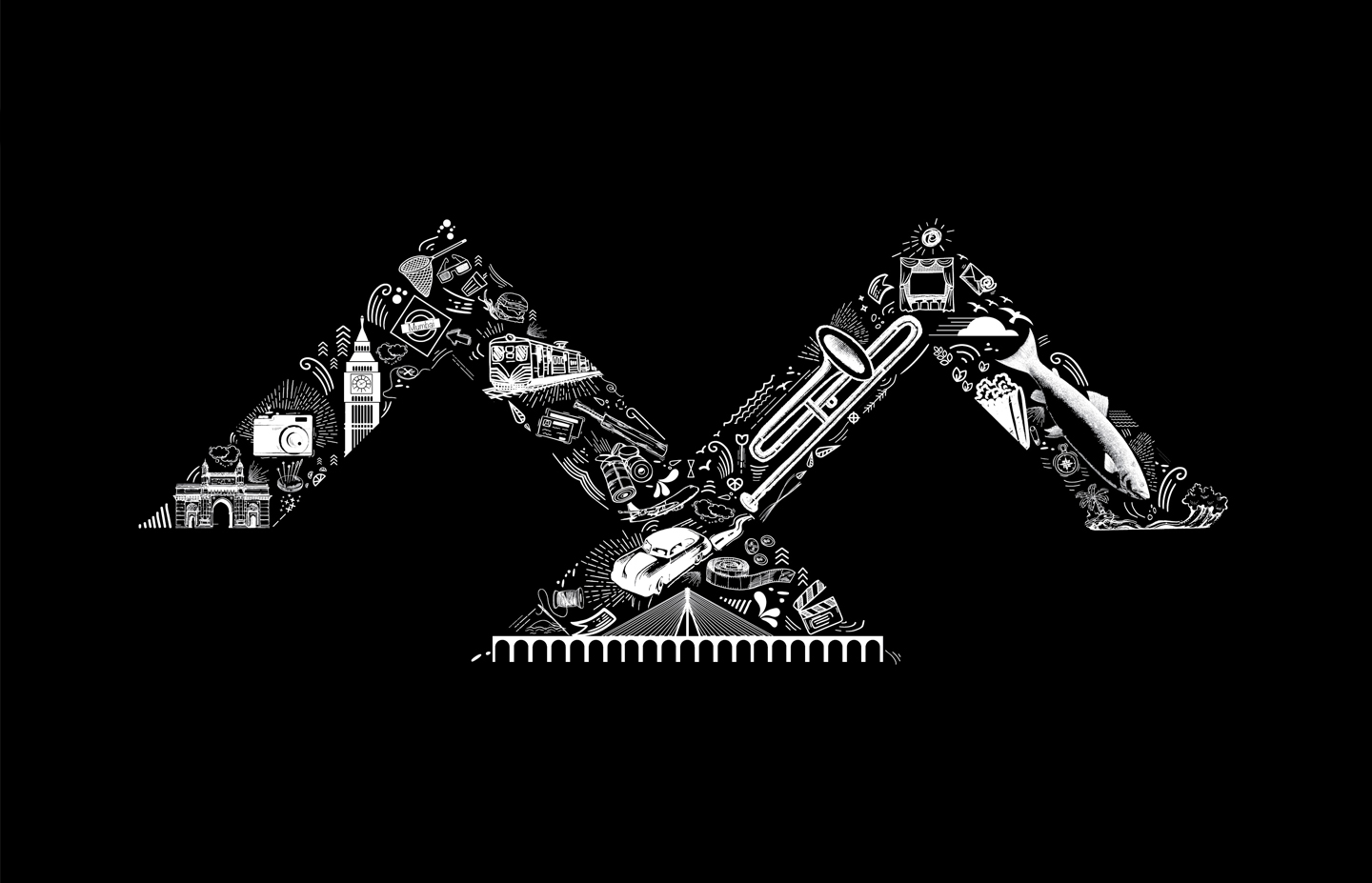
The integration of the M as a livery pattern with various icons of Mumbai proved to be rich, fertile territory for the brand identity and retail.
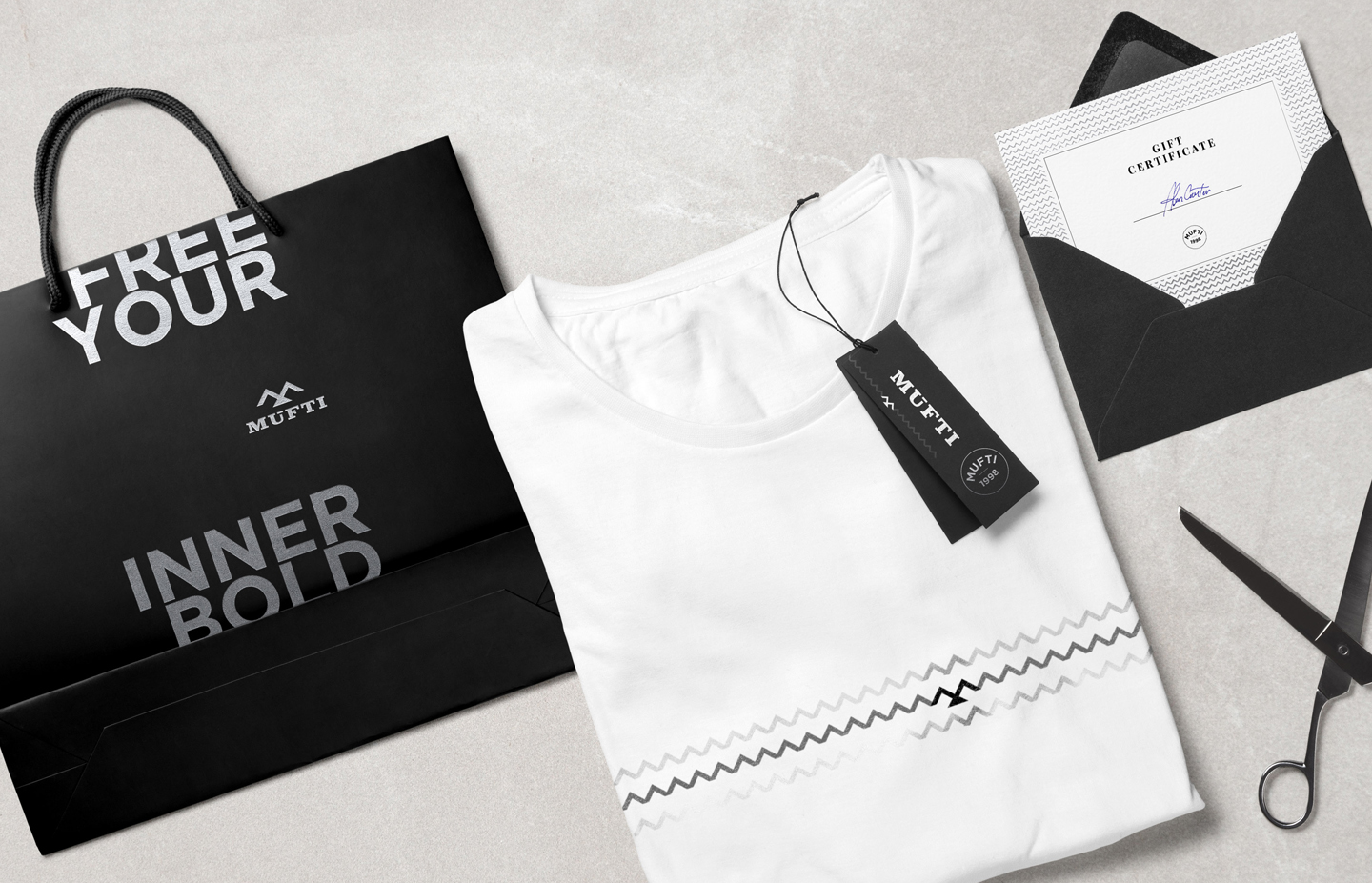
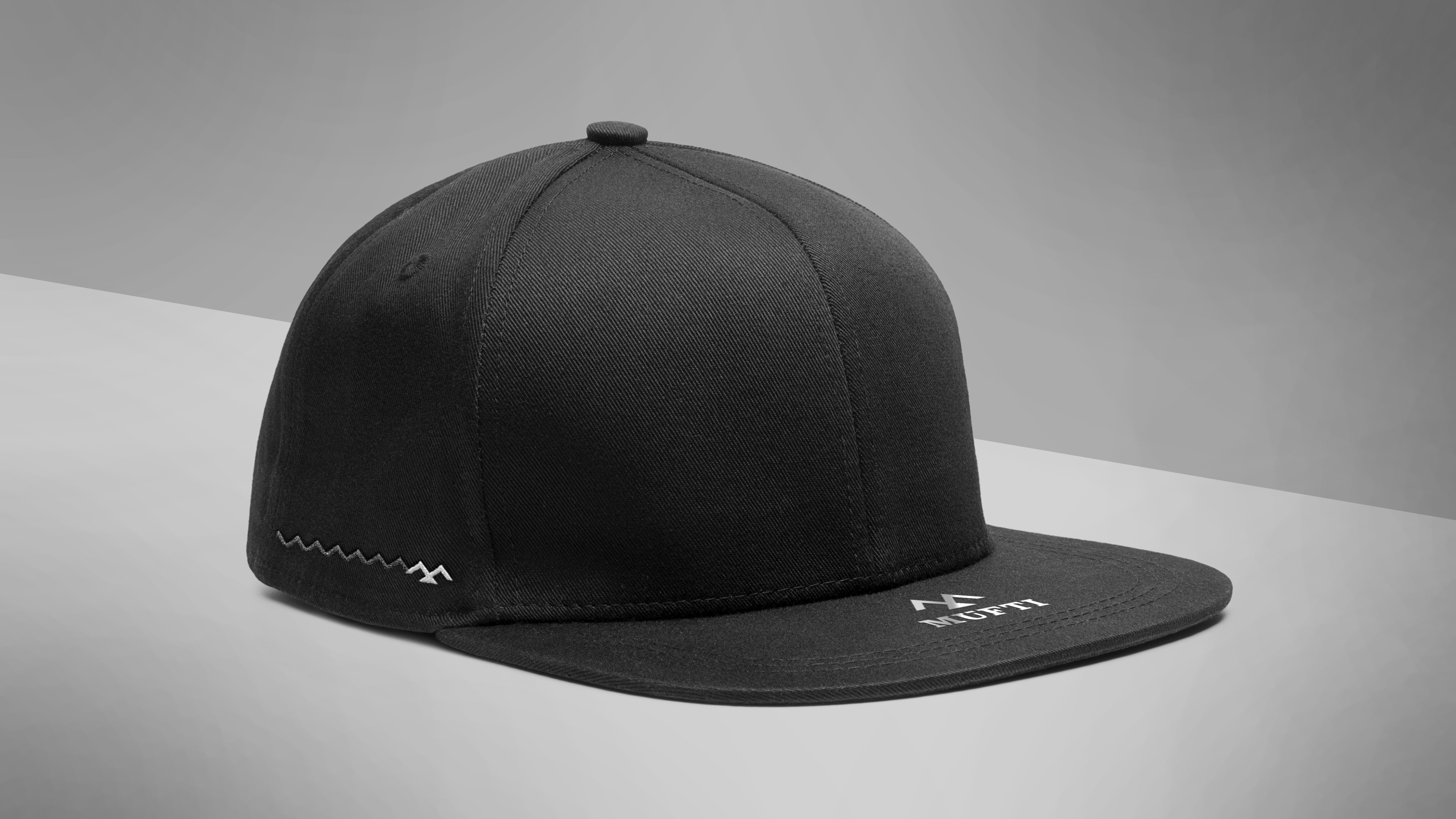
The design-centred principles were defined and the important part that Mumbai, the city, plays as the muse for this brand was celebrated unabashedly. The M icon, applied as a livery pattern across the retail environment, created an immersive brand world that felt authentically Mumbai — layered, dynamic, and impossible to ignore. The confident stance of the identity paid rich dividends at the retail level, where the campaign was a big success.
Mufti — Hyphen Brands case study

Mufti Apparel's and denimwear — an iconic two-decade-old Indian brand — was planning to relaunch their identity. The attempt was to define its core DNA and accentuate its unique story. The identity celebrated its origins and found a simple expression which could be used as a visual icon across retail, apparel, communication and digital.

Started by a young entrepreneur and inspired by the bold undying spirit of Mumbai, the apparel brand always paid homage to the street fashion of the city. The starting alphabets, both in English and in Devanagari — M for Mumbai, which is the fashion muse for Mufti — provided an excellent starting point for the identity.

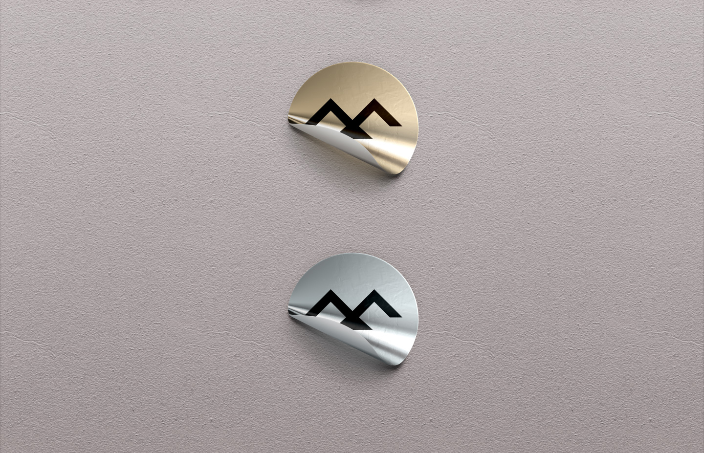
The graphic form of the Devanagari M and English M were merged and a unified shape became the visual icon of Mufti. The icon also represented the soaring of a bird and the brand delivering the tagline of Airborne since 1998.

The form that was created also subliminally persuaded the viewer into seeing one of two things — a flying bird or a zigzagging line. This dynamic contrasting and hypnotic play in pattern was not accidental but curated very purposefully, to foster a sense of occasion for the retail spaces as well as eye-catching digital in the form of GIFs and animations.

Next Project
Arvind Fashion
Ready to build an
extraordinary brand?
Brief Us →