Kyoorius + 4
Jharanai Dairy
Case Study

Jharanai Dairy

Rushikulya Agrotech
Scroll
Discipline
Brand Identity · Packaging
Client
Jharanai Farms, Berhampur, Odisha
Scope
Naming · Identity · Packaging · Communication
The Brief
Jharanai — a brand of pure, natural milk from Berhampur, Odisha — wanted their brand packaging to be as premium as their standards of purity. Their farm sits beside a 25 sq km lake, in the Karandimal Range, away from all human settlement. This pristine tribal environment creates the ideal conditions for pure, high-quality milk. The brief: make the packaging as pure as the product.
Premium Achieved
50%+ price premium over competition in Odisha
Growth
200 to 2,100 litres per day — 10× production growth
Recognition
Kyoorius Design Awards entry · International packaging press
01
The pristine, pure environs of the dairy provided the inspiration to give birth to a simple — and more importantly, pure — identity palette.
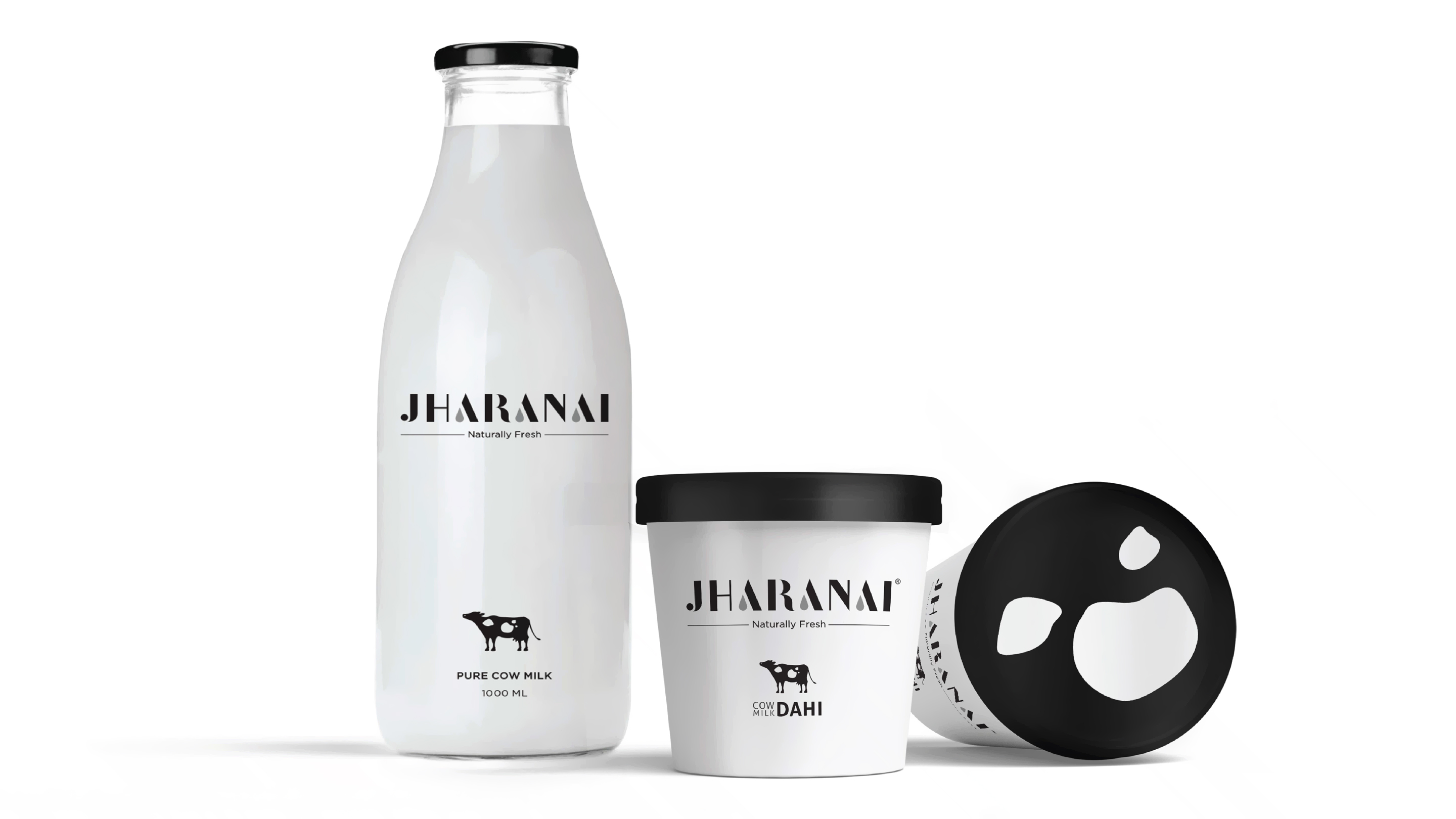
Black and white. The most elemental colour story. Pure, uncontaminated, honest. The moment we arrived at this palette, everything else followed naturally. It communicated purity without claiming it. It let the provenance speak without noise. And it created a visual world unlike anything else in the dairy category — which is almost universally cluttered with colour, illustration and noise.
Jharanai Dairy
02
Patta-chitra — the original Odisha tribal illustration style — was used to depict modern subjects in black and white. And proved our provenance seamlessly.
For the natural provenance of the brand, its authenticity and its pure origins, we chose the most authentic tribal art form of the region — Pattachitra, from Odisha. Sketched first by the original artisans of Odisha, the scenes of modern milk-making processes and the pristine farm environments — replete with tribal iconography — were later converted into digital formats. This ancient illustration style, previously only seen on dried palm leaves, was rendered in simple, elegant black and white for a premium look. These stylised visuals looked premium while also capturing the authenticity and purity of the farm.
Jharanai Dairy
Jharanai Dairy
03
Even the black and white patches of the Holstein cows were incorporated cleverly into the range — extending into communication and creating a highly impactful brand packaging.
The pure black and white illustration and colour palette gave us a brand visual identity which has now become the definition of pure milk in Odisha. The distinctive Holstein cow patches became a secondary design system — used across packaging, communication and retail. The consistency of this provenance message, everywhere the brand appeared, created an unshakeable impression of authenticity.
Jharanai Dairy
Jharanai Dairy
Jharanai Dairy
04
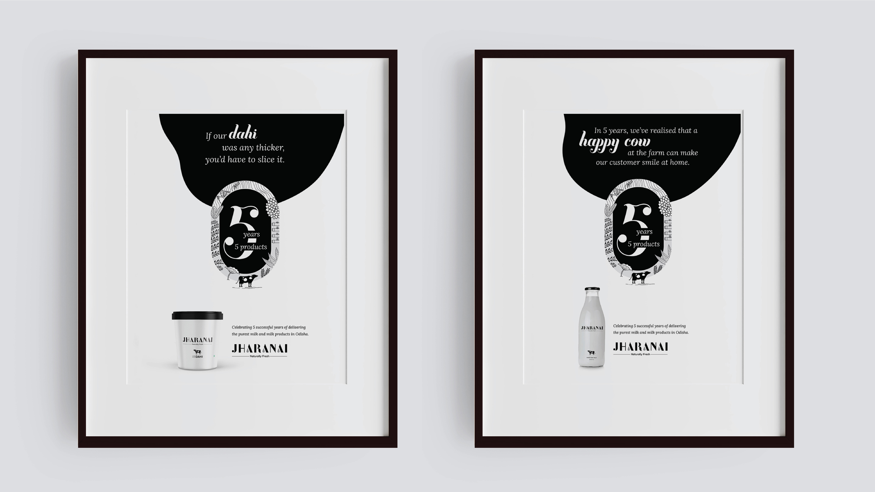
The consistency of the provenance brand message — in packaging, communication and retail — has yielded a 50%+ premium over the competition.
The connect to consumers was built by the wit in the classic copywriting style that rewarded them for their attention and time. And the results speak for themselves: from 200 to 2,100 litres per day, Jharanai Farm's milk production has grown tenfold. Not only milk, but by-products — dahi, ghee, lassi, buttermilk and peda — all carry the brand values of purity. With all units selling out daily and demand growing, the cows love their time on the farm just as much as the customers love Jharanai.
Jharanai Dairy

Jharanai — a brand of pure, natural milk from Berhampur, Odisha — wanted their brand packaging to be as premium as the high standards of purity used in their milk production. Their farm is situated in the Karandimal Range beside a huge lake, covering an area of almost 25 sq. km, located away from human settlement.

For the natural provenance of the brand, about its authentic and pure origins, we decided to use the most authentic tribal art form of Pattachitra from this region of Odisha. Sketched first by the original artisans of Odisha, the scenes of modern milk-making and the pristine farm environs replete with tribal iconography were later converted into digital formats.

This ancient illustration style, previously only seen on dried palm leaves, was converted into simple, elegant black and white illustrations for a premium look. These stylised visuals, while looking premium, also captured the authenticity and purity of the farm. As pure as a tribal art form.

The pure black and white illustration and colour palette gave us a brand visual identity which has now become the definition of pure milk in Odisha. Even the black and white patches of the Holstein cows were incorporated cleverly into the range — extended into communication — thereby creating a brand packaging that was highly impactful.

The consistency of the provenance brand message, be it in packaging, communication or retail, has yielded a 50%+ premium over competition in Berhampur and Bhubaneswar. From 200 to 2,100 litres per day, Jharanai Farm's milk production has grown tenfold. With all units getting sold out daily, it's safe to say the cows love their time on the farm just as much as the customers love Jharanai's dairy products.

Next Project
IBC Craft Brewery
Ready to build an
extraordinary brand?
Brief Us →