Packaging of the World + 1
IBC Craft Brewery for Independence Brewing Co. — Hyphen Brands case study
Case Study

IBC Craft Brewery

Independence Brewing Co.
Scroll
Discipline
Brand Identity · Packaging · Communication
Client
Mia Diamanté Entertainment
Scope
Brand DNA · Identity · Packaging · Manifesto
The Brief
Craft beers often talk only about the flavours they offer. But the consumer is going through something bigger in his life. Urban loneliness — intensified by two years of pandemic — had taken us away from essential social interactions. The brief: build a brand that fights back.
Recognition
Packaging of the World — International Design Press
International Press
Brand DNA
Togetherism — coined, owned and celebrated by Independence Brewing Co.
Culture
Brand IPs including Pints & Poems created from brand DNA
01
The basic human truth — a brewery has the power to be more than a watering hole. It has the potential to turn a like-minded stranger into a friend for life, over a beer.
Today's fragmented world has taken us away from essential social interactions and left us feeling alone and distanced from everyone. This urban loneliness was further intensified in the two years of the pandemic. The micro-brewery brand attempts to revive the joy of meeting forgotten friends on an impromptu weekday night, making new friends on the weekend brunch plan or just chilling with your besties over a glass of chilled craft beer at home.
IBC Craft Brewery for Independence Brewing Co. — Hyphen Brands case study
02
A category contrarian approach — not to highlight flavours, but to fight Urban Loneliness as a social cause, by propagating the philosophy of 'Togetherism'.
Anything is better together, not individually. This is the camaraderie which is the driving force of the new Independence Brewing Company. And it's a happy social revolution we intended to start. This value was ingrained into the brand DNA as Togetherism — a word we coined, a movement we started, a philosophy that gave the brand its entire visual and verbal universe.
IBC Craft Brewery for Independence Brewing Co. — Hyphen Brands case study
03
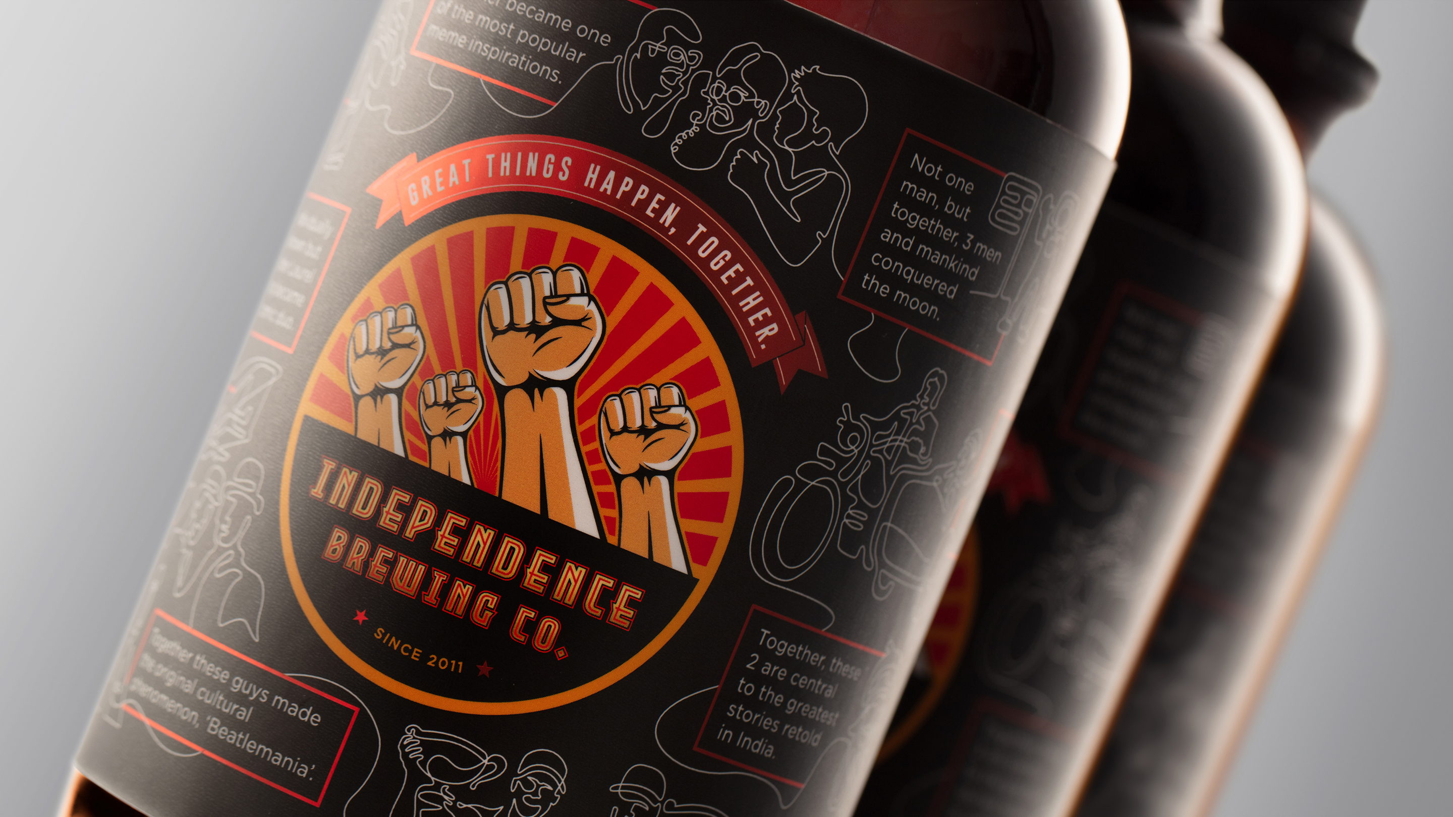
The clarion call of 'Great things happen, together.' was an inclusive message that also inspired the propaganda poster art direction style.
To propagate this Togetherism, a label completely distinct from the category was designed. Instead of generic flavours labels, ours depicted the true spirit of coming together. On a matte monochrome background, propaganda-style hands raised together — rendered in warm beer colours — stood out in the centre. Strong rays behind gave optimism and energy. In an elegant matte black label, a single white unbroken line depicted examples from around the world where great things have happened when people have come together — The Wright Brothers, Laurel and Hardy — illustrated in a single unbroken line that also demonstrates this united philosophy.
IBC Craft Brewery for Independence Brewing Co. — Hyphen Brands case study
04
Urban loneliness is a modern social bane. 'Togetherism' was the brand's answer — and it became a genuine cultural movement.
The brand went well beyond product peddling, towards a greater social purpose. IPs like Pints & Poems — an open mic poetry evening — were born from the same Togetherism DNA. The logo for Pints & Poems integrated a pen nib and a microphone in negative and positive space, animated into a smooth motion logo. The art style imparted a distinct identity amongst other craft beers which were simply trying to sell flavours. The packaging identity always reminded the brand of its intended result: Great things happen, together.
IBC Craft Brewery for Independence Brewing Co. — Hyphen Brands case study

Craft beers often talk only about the flavours they offer. But the true joy of beer is the spirit of camaraderie and bonding that it offers. This value was ingrained into the brand DNA as Togetherism.

To propagate this Togetherism, a series of posters were designed for the retail restaurants of Independence Brewing Company. The brand's tagline — Great things happen, together — encapsulates the same philosophy. Since we wanted to make it a people's movement, the design language of propaganda posters was adopted. Strong warm colours, which also connected to the beer world, were used. English — sometimes staccato, sometimes broken — reminded one of communist Russian clarion calls.

In an elegant matte black label, a single white unbroken line depicted examples where great things have happened when people have come together. The illustration style — a single unbroken line — also demonstrates this united philosophy. On this matte monochrome background, the propaganda-style hands raised together logo, rendered in warm beer colours, stood out in the centre.

A manifesto was written and designed for the retail restaurants. It evoked and gave the benefits of sharing joy and sorrows, laughter and pain with friends — and how having friends around makes great things happen, together. Like a night out can turn even the worst day of your life into laughter and smiles.

The brand's own internal events, like Pints & Poems — an open mic poetry night — extended the Togetherism DNA into real-world IP. The logo integrated a pen nib and a microphone in one unified animated form. The result: a brand that was genuinely loved, not just consumed.

Next Project
Zee Zest
Ready to build an
extraordinary brand?
Brief Us →