The Financial Brand + 1
IDFC Bank Identity
Case Study

IDFC Bank

IDFC Bank
Scroll
Discipline
Strategy · Positioning · Branding · Design Manual
Client
IDFC Bank
Scope
Logo · Stationery · ATM · Credit Cards · Branch Design
The Brief
India's 53rd bank had one shot to not look like the 52 before it. No alphabet soup. No single colour. No convention. Just a completely new idea of what a bank could be.
IDFC Bank Identity
01
Twenty-three stakeholder interviews distilled into one word: Unbank.
When IDFC received its banking licence, it entered a market dominated by identities built on acronyms — ICICI, HDFC, IDBI. The challenge was to stand out using nothing but the identity itself. After 23 in-depth stakeholder interviews with top management, a clear picture emerged. IDFC's leadership had a genuinely maverick approach to banking. Rather than follow the mandated ratio of two urban branches to every one rural branch, they chose to go rural first. The brand thought that captured this spirit precisely was 'Unbank' — and it became the strategic and creative foundation for everything that followed.
IDFC Bank logo system
IDFC Bank colour palette
02
Instead of owning a single colour — as every bank in India does — we chose to own the colours of India itself.
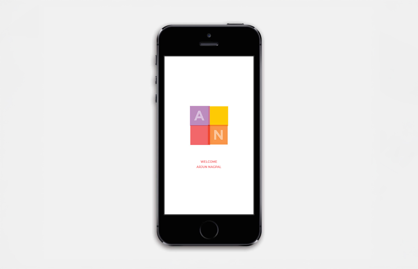
The strategic decision to use the harvest colours of India rather than one brand colour was deliberate and radical. No Indian bank had done it before. A vibrant bank of colours worked on two levels simultaneously — it resonated deeply in rural India through its cultural warmth, and it translated beautifully onto electronic and digital screens for urban youth. The four-square identity was designed to be malleable — capable of being arranged in different stackings and orientations, giving the system endless flexibility without losing coherence. A transparency design motif emerged from the grid, making every piece of communication instantly recognisable.
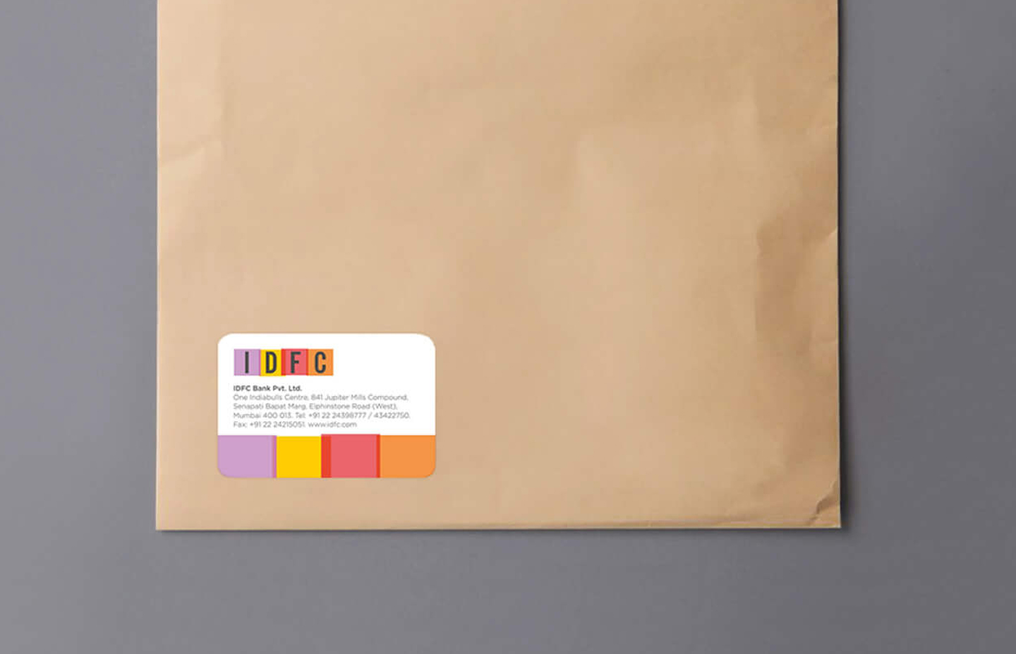
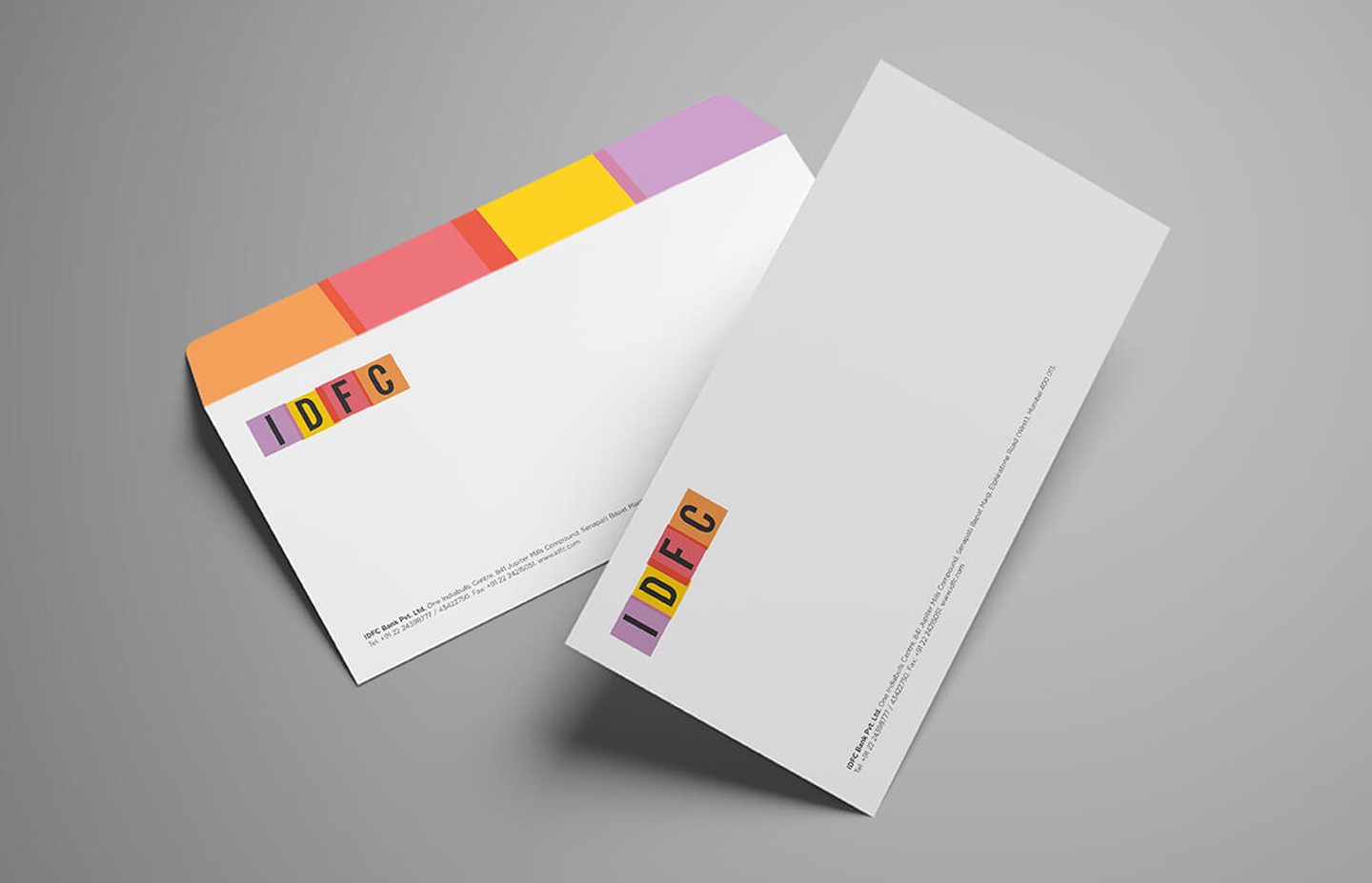
IDFC Bank stationery
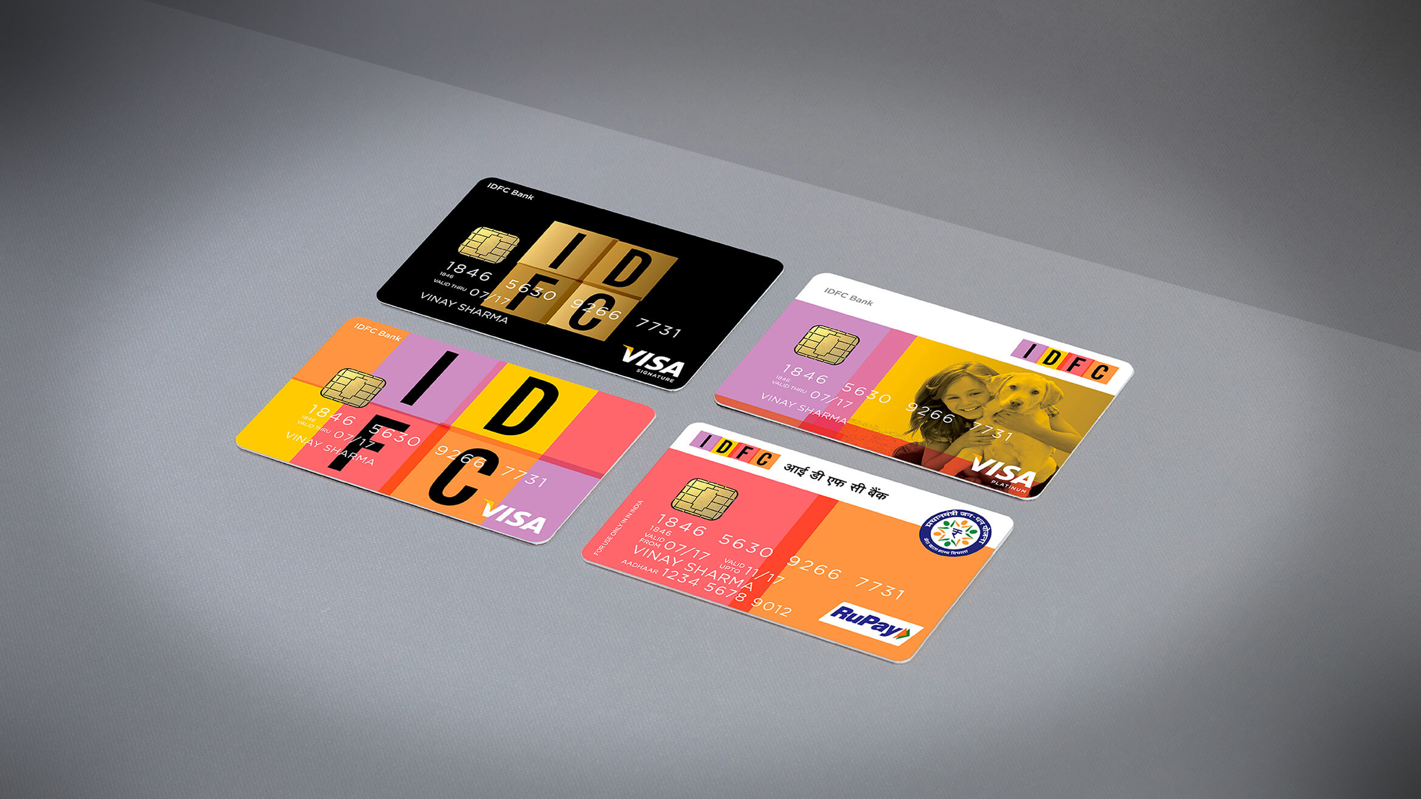
IDFC Bank cards
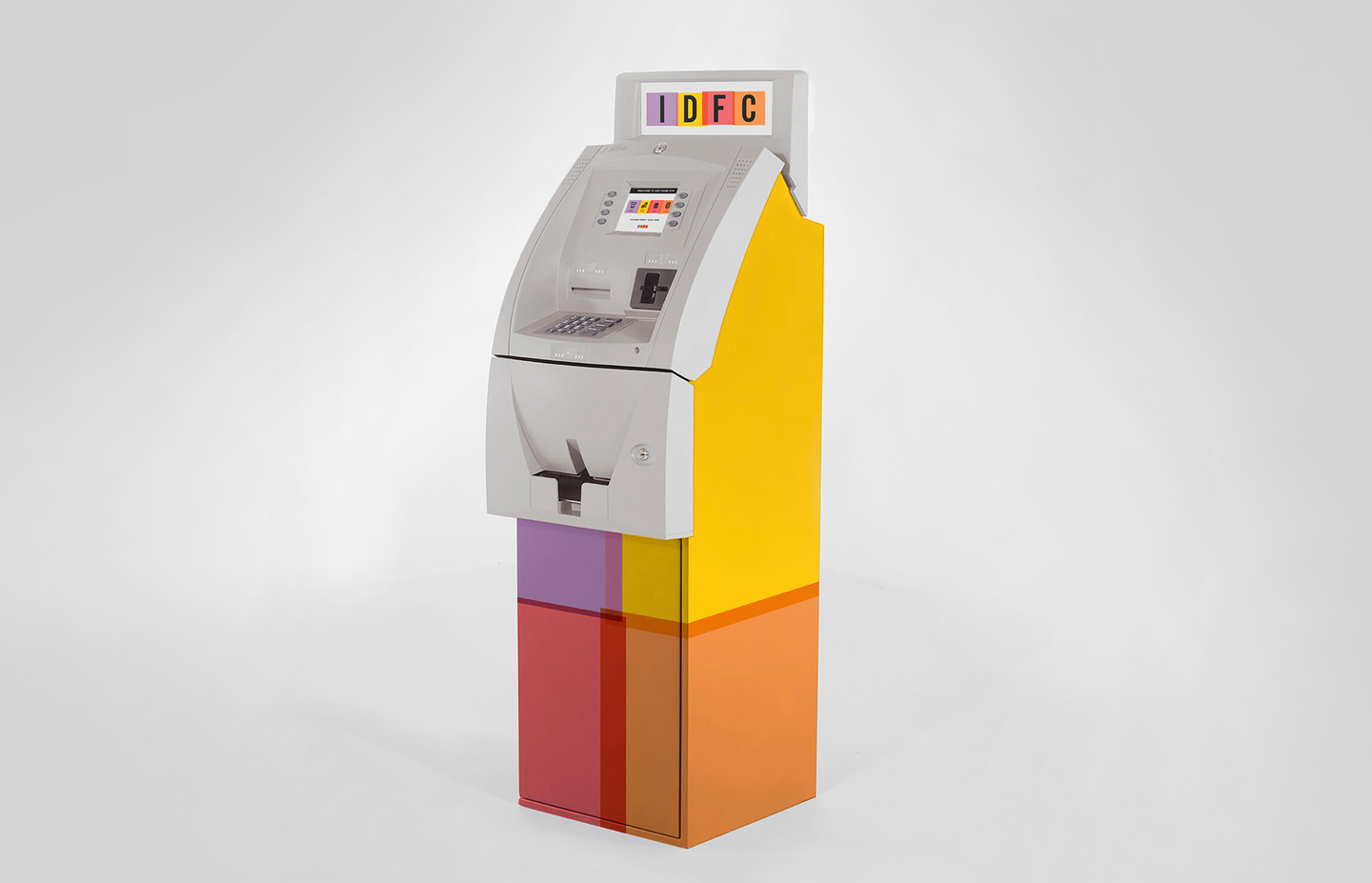
IDFC Bank ATM
03
The philosophy of Unbank gave rise to many firsts — including India's first fingerprint scanner for home-based account opening.
The identity was never just a logo. It spanned every possible consumer touchpoint — ATMs, credit cards, ATM vending machines, branch interiors, app icons, stationery and business cards. Branch design was conceived with a single-minded brief: do not look like a bank branch. The Unbank philosophy inspired product innovation as well. IDFC Bank introduced India's first fingerprint scanner that could come to a customer's home to open an account — a landmark moment in Indian banking. The identity system was the visual expression of that same courage.
IDFC Bank branch design
Recognition
Voted one of the 9 most beautiful bank identities in the world — The Financial Brand, 2016
Scale
Identity deployed across every consumer touchpoint — ATM, branch, cards, digital, stationery
Impact
Created a buzz at India's most high-profile bank launch — a first-of-its-kind identity in Indian banking

Since IDFC Bank was the 53rd player to receive a banking licence in India, the challenge was to stand out amongst the alphabet soup of bank names — ICICI, HDFC, IDBI — using only the identity as a tool.

Upon going through 23 different major stakeholder interviews, we distilled the brand thought to 'Unbank' — because the top management had a genuinely maverick approach to banking. Instead of the usual two-urban-to-one-rural branch ratio mandated by regulation, IDFC Bank took a contrarian approach and went rural first.

The strategic route decided was to own the vibrant colours of India instead of a single colour, as is the norm in Indian bank identities. We chose the colours of the harvest. This bank of colours worked in rural India through its vibrancy, and with urban youth because of its adaptability to electronic and digital screens.

The identity spanned all possible consumer touchpoints — ATM, credit cards, ATM vending machines, branch design, app icons, stationery. Branch design was also conceived with a single-minded brief: do not look like a bank branch. The philosophy of Unbank gave rise to many firsts, including India's first fingerprint scanner that could come to a customer's home for account opening.

The four-square identity was malleable enough to be arranged in different stackings. It also provided a great transparency design motif that made all communication instantly recognisable. Not only was the identity well received in India and created a buzz around the launch of IDFC Bank — it was also voted one of the 9 most beautiful bank identities in the world by The Financial Brand in 2016.

Next Project
Zee Zest
Ready to build an
extraordinary brand?
Brief Us →