Packaging of the World + 1
Case Study

Happier

Dr. Morepen
Scroll
Discipline
Brand Identity · Packaging Design
Client
Happier Foods / Dr. Morepen
Scope
Naming · Identity · Packaging
The Brief
Create a distinct packaging design for Dr. Morepen's skincare and wellness line — Happier. The brief was simple on the surface. But with a brand name like Happier, we decided we wanted to achieve something far greater than shelf appeal.
Recognition
Featured in Packaging of the World — International Design Press
International Press
Impact
India's first Braille-enabled skincare packaging
Result
Organic influencer community growth — zero paid sponsorship needed at launch
01
A happier experience means a packaging design that is truly inclusive — a delightful interaction for even the visually impaired, with Braille product descriptors.
Traditional skincare and wellness packaging caters exclusively to the visual appetite of buyers in the retail space. The visually impaired don't get to enjoy that consumer experience. Happier decided to change that — by taking a leap with its design, not only playing with product textures but creating a more inclusive packaging for all consumers to enjoy. This became our central design conviction from the very first brief.
Happier for Dr. Morepen — Hyphen Brands case study
02
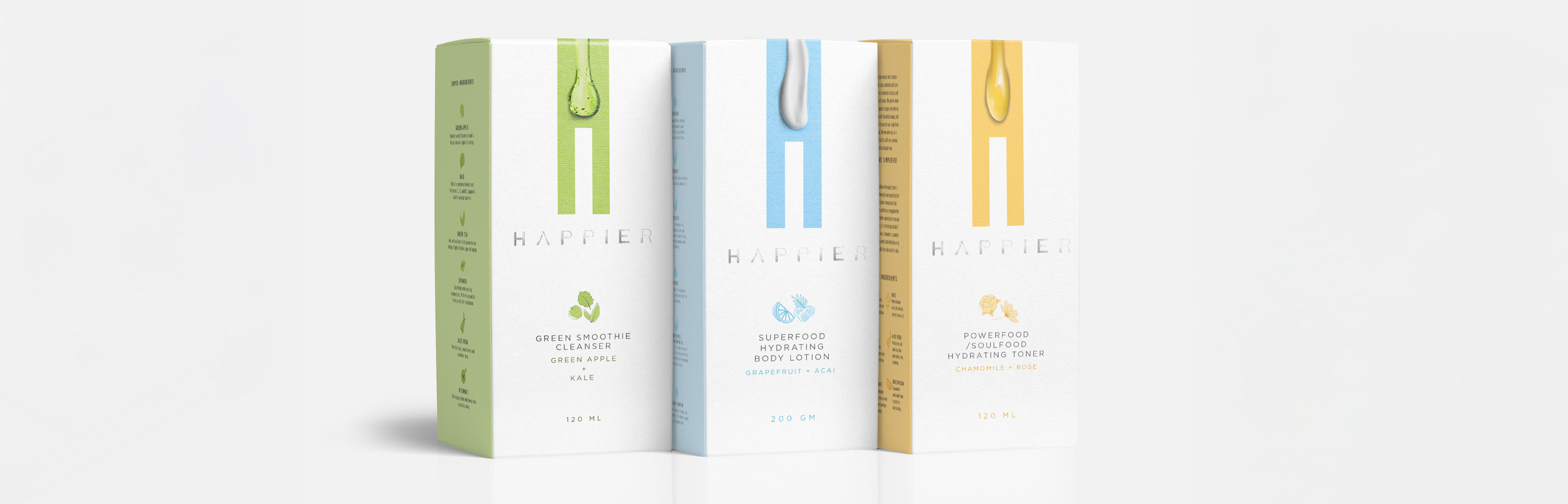
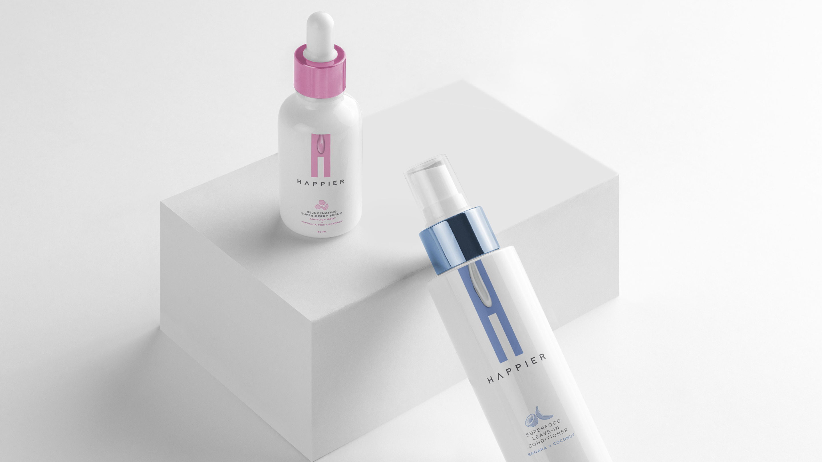
The monolithic 'H' on the pack face not only provides a strong template — the negative space also serves as a product texture sampling area.
Happier created a first-of-its-kind brand identity for their skincare line, with a pinpoint focus on the ingredient story of every product. The design included the letter H with embossed smears of each product's ingredient texture, colour and fragrance — so buyers could get an authentic feel for it even before using it. The H became both a structural system and an experiential device simultaneously.
Happier for Dr. Morepen — Hyphen Brands case study
03
No detail was too small. The vast knowledge of herbs was used to create a livery pattern for the carton's inner lining and every touchpoint.
The promise of a happier world is delivered with maximum impact because the brand has the unique balance of having access to the best herbs and the best scientific knowledge of its mother brand, Dr. Morepen. The inner lining pattern — invisible at purchase but revealed on opening — became a signature moment of delight that the brand's community began sharing organically on social media.
Happier for Dr. Morepen — Hyphen Brands case study
04
A simple packaging innovation made the world of the visually impaired a happier place — and brought our inclusive philosophy to life.
Within a few weeks of launch, this Braille-enabled packaging design put Happier on the radar of make-up influencers across the country. With a growing social media community paying heed to the new design approach organically, paid sponsorships weren't needed. Through this endeavour, Happier opened the eyes of other brands in the category to consider adopting this design innovation — creating a more seamless and inclusive consumer experience for all.
Happier for Dr. Morepen — Hyphen Brands case study

The design brief was simple. Create a distinct packaging design for Dr. Morepen's skincare and wellness line — HAPPIER. Traditional skincare and wellness packaging design caters to the visual appetite of buyers in the retail space.

So while we knew that our packaging design had to look visually arresting, with a brand name like Happier, we decided that we wanted to achieve a greater purpose. Because unfortunately, the visually impaired don't get to enjoy the luxury of such a consumer experience. Happier decided to change that by taking a leap with its design — not only playing with product textures but creating a more inclusive packaging for all consumers to enjoy.

Happier created a first-of-its-kind brand identity for their skincare line with a pinpoint focus on the ingredient story of every product. The design included the letter H with embossed smears of each product's ingredient texture, colour, and fragrance, so buyers could get an authentic feel for it even before using it.

The monolithic H on the pack face not only provides a strong template, but the negative space also serves as a product texture sampling area. No detail was too small. The vast knowledge of herbs was used to create a livery pattern that was used in the carton's inner lining.

Within a few weeks of its launch, this Braille-enabled packaging design put Happier on the radar of make-up influencers across town. With a growing social media community paying heed to our new design approach organically, paid sponsorships weren't needed. A simple packaging innovation made the world of the visually impaired a happier place — and brought to life our inclusive philosophy of making everyone Happier Everyday.

Next Project
Jharana Dairy
Ready to build an
extraordinary brand?
Brief Us →