Case Study

Embarc Education

Embarc Admissions, Singapore
Scroll
Discipline
Brand Strategy · Brand Identity · Digital
Client
Embarc Admissions, Singapore
Scope
Naming · Identity · Website · Merchandise · Motion
The Brief
Create a dynamic brand identity for Embarc Admissions — an undergraduate admissions counselling company based in Singapore. The goal: help students from India land their dream spots at Ivy League colleges overseas. Every year, 800,000 undergraduate students from India head abroad for better educational opportunities. Like birds migrating to new horizons, they are ready to soar. Embarc becomes their guide.
Result
100% placement — every Embarc student secured an Ivy League spot
Scope
Logo · Website · Motion Graphics · Merchandise · Custom Typeface
Market
Singapore-based · India-facing · International Ivy League focus
01
How do you create a stellar identity for a start-up undergraduate admissions company? You let knowledge take flight.
The brand needed to communicate both aspiration and expertise simultaneously — the hope of a student and the confidence of a guide. This tension was the creative brief. The identity had to feel international enough to represent the Ivy League ambition, and warm enough to represent the Indian family that was trusting Embarc with their child's future. We captured the student's life-changing journey in a single unified logo idea.
Embarc Education for Embarc Admissions, Singapore — Hyphen Brands case study
02
Hundreds of thousands of undergrad students in India seek newer horizons abroad. Embarc Admissions has the expertise and the knowledge to help them soar.
A bird in flight paired with a timeless symbol of knowledge — a book. The bird represents students embarking on their academic adventure abroad: exploration, independence, and the reassurance that they are ready to take on the world. The book is the foundation of their journey — knowledge, education, and the pivotal role Embarc plays in shaping their future. Together, these elements constitute the wordmark and logo. Two icons, one idea.
Embarc Education for Embarc Admissions, Singapore — Hyphen Brands case study
03
A simple idea gave birth to an impactful, universally recognisable logo. Or as we like to call it — the wings of education.
For the colour palette, we created a custom primary and secondary palette using shades of purple and pink to enhance the brand and the elements within its universe. These modern tones reflect passion, success and achievement — in short, everything students strive for when they sign up with Embarc Admissions. The identity didn't stop at the logo. We carried the concept forward across digital communication templates, merchandise and website design.
Embarc Education for Embarc Admissions, Singapore — Hyphen Brands case study
04
Embarc Admissions isn't just an admissions counsellor. It is a catalyst for dreams realised.
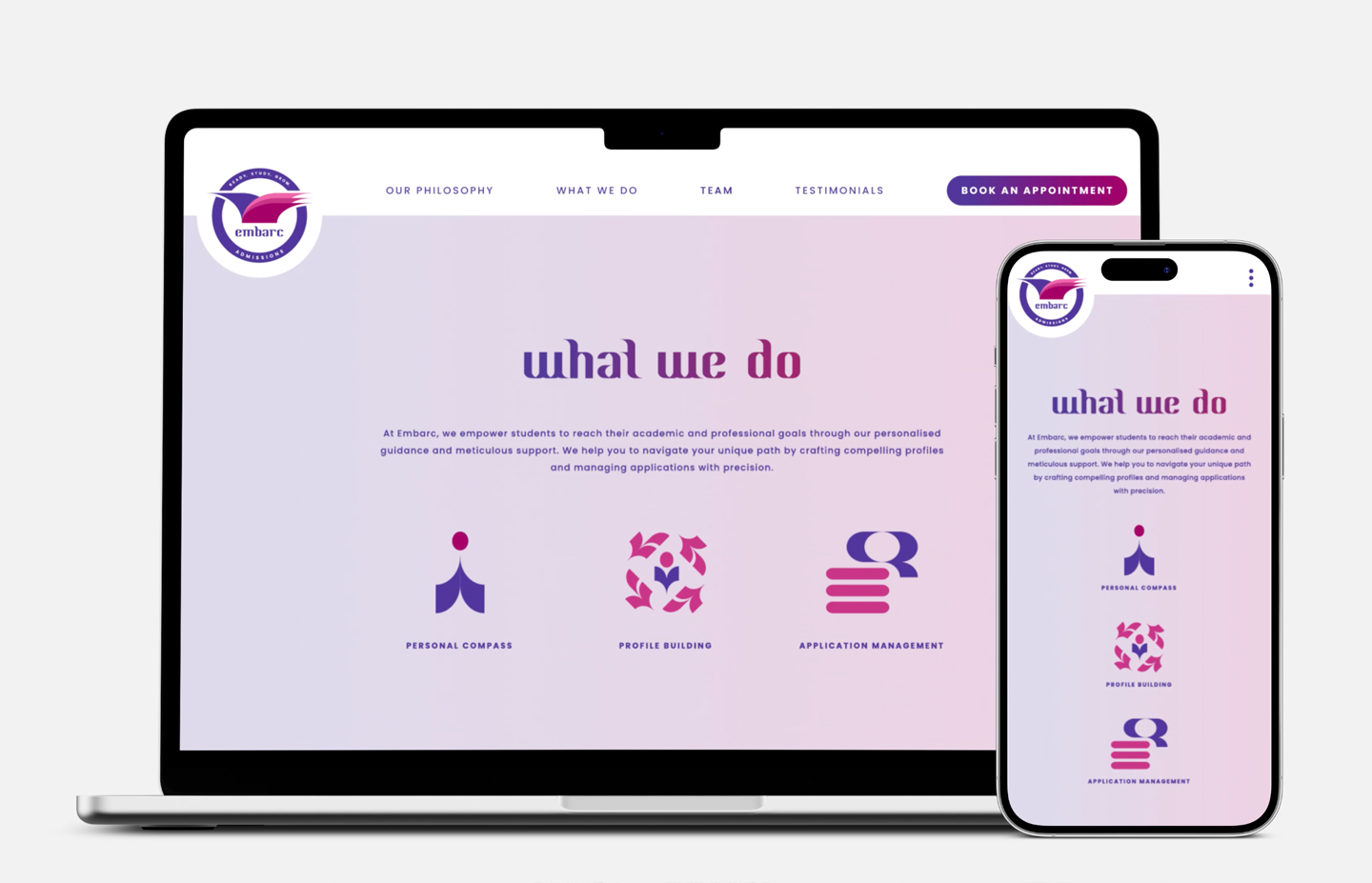
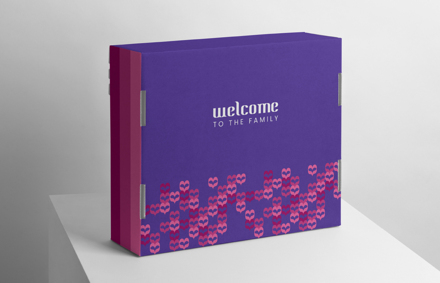
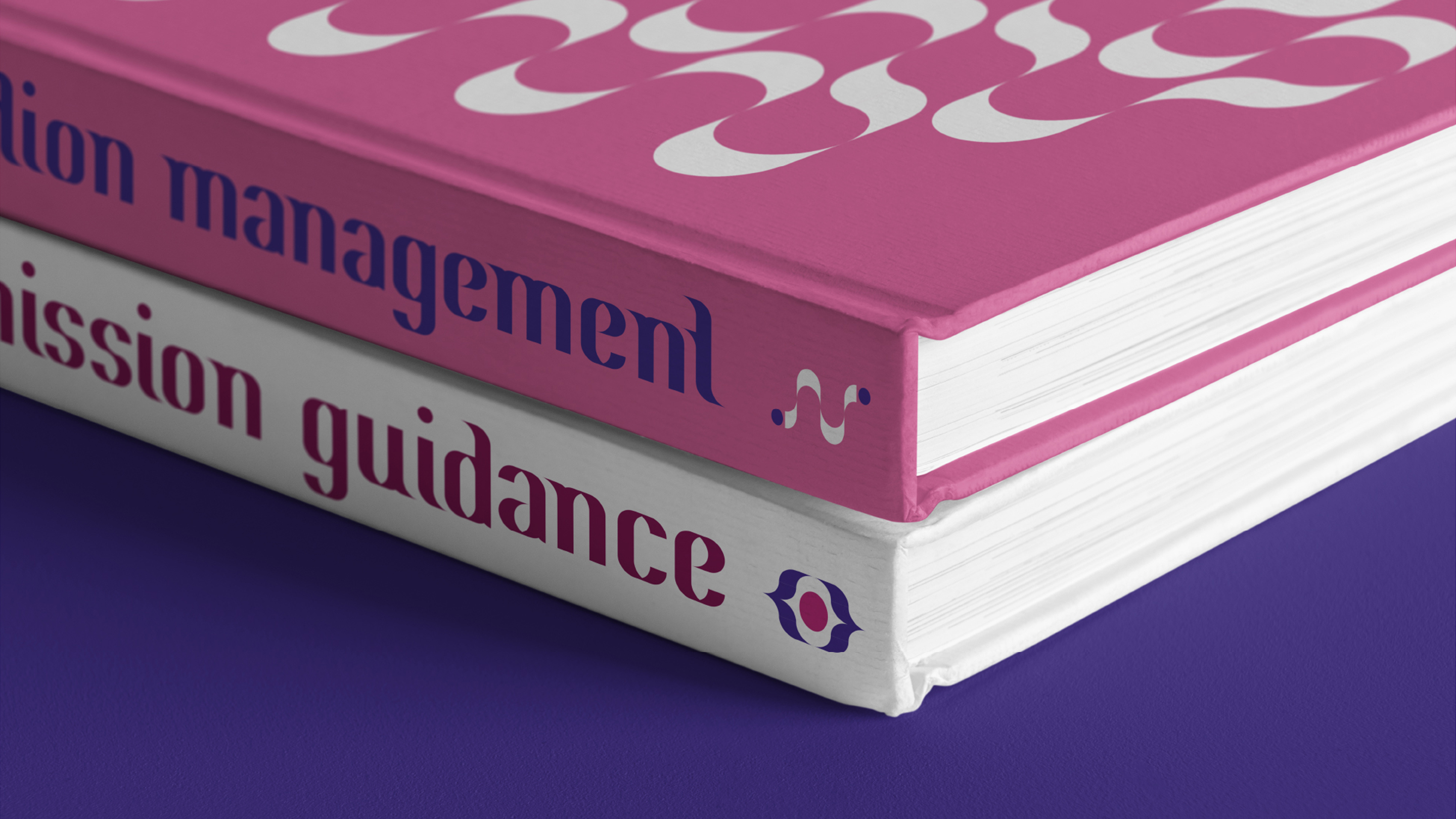
The pivotal form of the Page-Wing — inspired by the logo — was used across the brand's visual language. Iconography, motion graphics and a custom typeface made the identity come alive. Lanyards, T-shirts and USB drives featuring the iconic book symbol became the face of Embarc's brand in the real world. The website was brought to life with the same iconography, keeping the brand cohesive at every touchpoint. And the best part? Every student who trusted Embarc Admissions secured a spot at one of the eight Ivy League colleges.
Embarc Education for Embarc Admissions, Singapore — Hyphen Brands case study

The objective was to create a dynamic brand identity for Embarc Admissions, an undergraduate admissions counselling company based in Singapore, helping students from India land their dream spots at Ivy League colleges overseas.

Every year, 800,000 undergraduate students from India head abroad for better educational opportunities. Like birds migrating to new horizons, they are ready to soar. Embarc Admissions becomes their guide on this life-changing journey.

We captured the student's life-changing journey in the logo — a bird in flight paired with a timeless symbol of knowledge: a book. The bird represents students embarking on their academic adventure abroad. The book is the foundation of their journey. Together, these elements constitute the wordmark and logo.

For the colour palette, we created a custom primary and secondary palette using shades of purple and pink. These modern tones reflect passion, success and achievement — everything students strive for when they sign up with Embarc Admissions.

The identity carried forward across digital communication templates, merchandise and website design. The pivotal form of the Page-Wing was used in iconography, motion graphics and a custom typeface. And the result: every student who trusted Embarc Admissions secured a spot at one of the eight Ivy League colleges.

Next Project
HER Insurance
Ready to build an
extraordinary brand?
Brief Us →