Animeta — Creator Tech Platform
Case Study

Animeta

Creator Tech Platform
Scroll
Discipline
Brand Strategy · Brand Identity · Visual Identity System
Client
Animeta, Creator Tech Platform
Scope
Strategy · Identity · Logo Design · Colour · Typography
The Brief
Animeta had a vision to become a beacon in global creator tech — a platform that would simplify technology and ultimately simplify content creators' lives. To do that, it needed a brand that spoke to every creator on earth, regardless of nationality, language, or the genre of content they made.
Reach
A single identity system built to work across every device, language and content category globally
Symbol
The video record button — the one visual every creator sees every day — as the universal logo device
System
A meticulously grid-constructed logo with every element a precise multiple of a single stroke unit
01
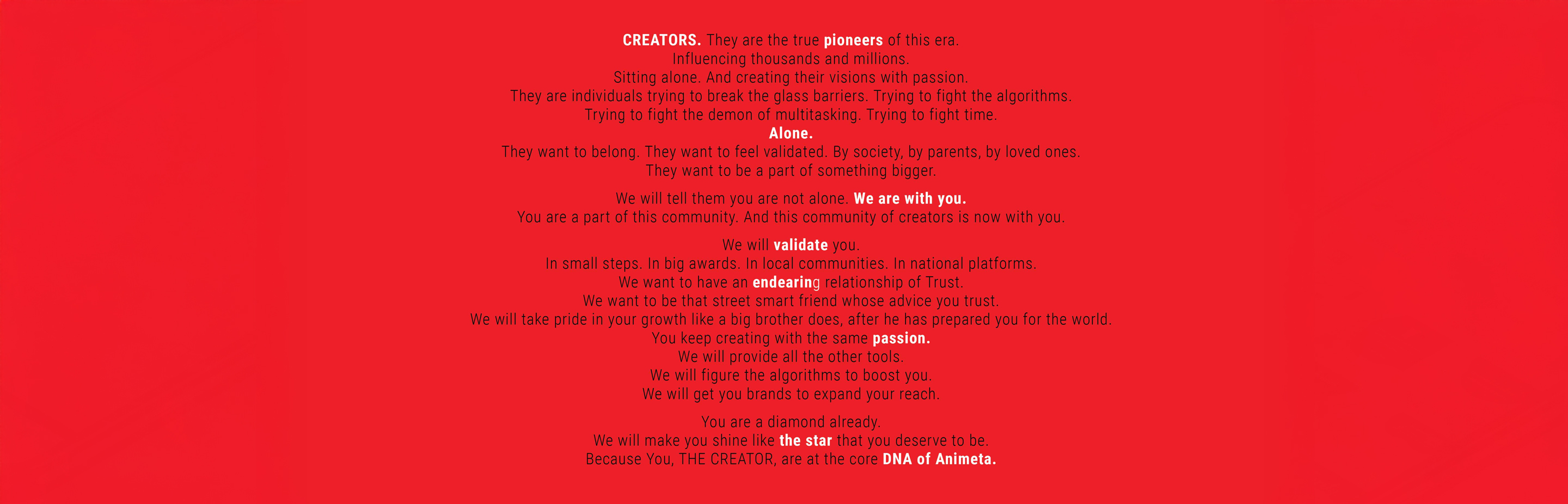
A creator needs to feel both democratic and legitimate — part of something bigger, yet seen as an individual. The brand had to hold both truths at once.
The strategic tension at the heart of Animeta was clear from the start: content creators are simultaneously seeking democratic access — tools, reach, brand deals — and legitimate status, the validation that what they do matters. They sit alone, fighting algorithms, fighting multitasking, fighting time. They want to belong. The brand had to speak directly to that reality — not as a corporate platform talking down, but as a street-smart friend who takes pride in your growth the way an older sibling does, after preparing you for the world.
Animeta — Brand Identity
02
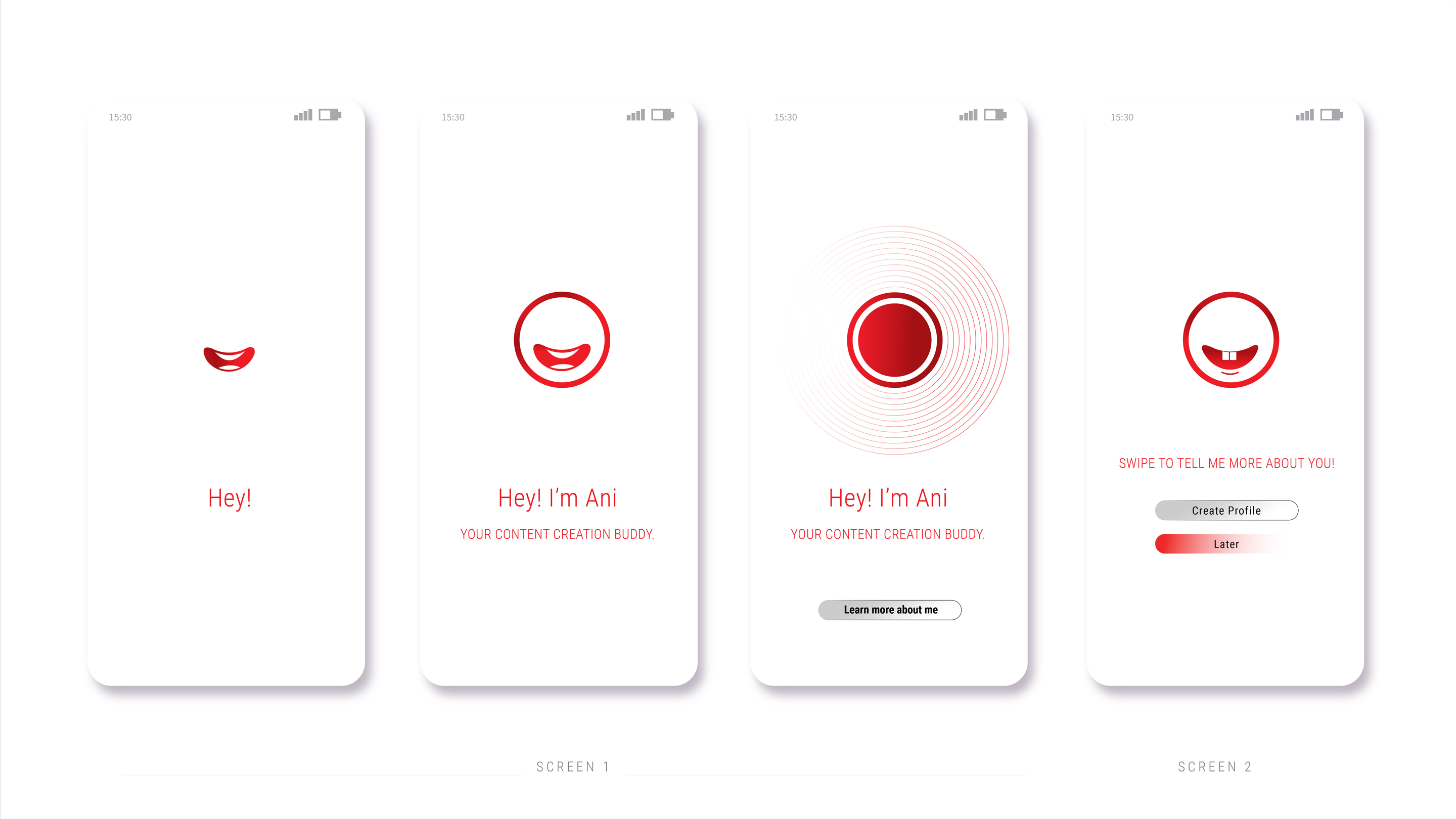
To unite creators of every nationality, language and genre, we needed one symbol they all share. We found it on the device in their hands: the video record button.
The identity challenge was specific: Animeta couldn't afford to feel different to different buckets of creators. A gaming creator, a beauty influencer, a political commentator — each category has its own tonality and quirks. A logo that leaned into any one of them would exclude the others. The solution was to find the one visual that exists across all of them, regardless of niche: the red record button on their phone. That symbol — the moment creation begins — became the core device of the Animeta logo, arranged in a clean horizontal stack beside a sleek, modern typeface.
Animeta — Identity System
03
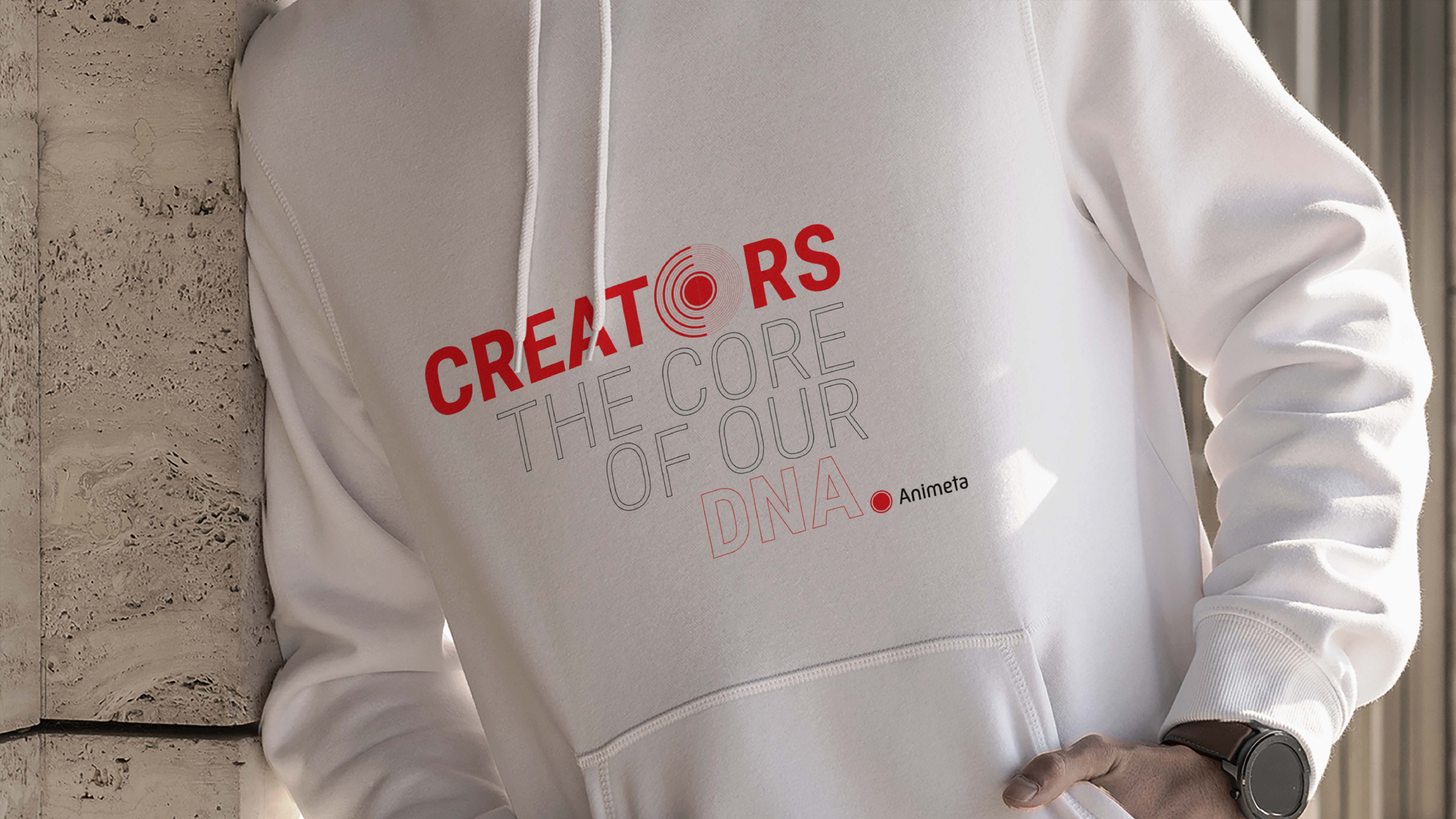
The logo construction is meticulously planned: every dimension is a precise multiple of a single font stroke width — a mathematical discipline that ensures perfect balance at any scale.
Simplicity at this level is never accidental. The Animeta logo was built on a strict modular grid where the unit of measurement is the width of a single font stroke — and every other element, spacing, and proportion is a multiple of that unit. No deviation from this system is permitted, because the balance it creates is not merely visual; it is structural. This kind of rigour is what separates a logo that merely looks clean from one that remains clean under any condition — on a phone screen, on a billboard, in a digital interface or on merchandise.
Animeta — Brand Application
04
Vibrant red and black for a Gen Z audience. Roboto as the universal typeface — a Google font that displays flawlessly on every device, everywhere in the world.
Colour for Animeta was never decorative — it was strategic. The vibrant red of the record button, set against black and interspersed with shades of grey, gave the brand the warm, bold energy that speaks to a Gen Z creator audience while maintaining the modernity a tech platform demands. For typography, Roboto — a Google font — was chosen with one specific purpose: to ensure flawless display across every device and every territory in which Animeta would operate. A creator in Mumbai and a creator in Manila see exactly the same brand, rendered exactly as intended.
Animeta — Brand Identity

Animeta arrived with a brief that was equal parts ambitious and precise: build a brand for a global creator tech platform that would be genuinely universal — not a brand translated across markets, but one that was conceived, from the ground up, to speak to every content creator on earth in exactly the same way. The challenge was compounded by the diversity of the creator economy itself. Gaming, beauty, finance, comedy, political commentary — each category has its own visual language, its own subculture, its own demands. A brand that tilted toward any one of them would alienate the others.

The strategic work began with a fundamental question about the creator: who are they, really? The answer that emerged was not a demographic profile but an emotional truth. Content creators are individuals fighting alone — against algorithms, against time, against the constant demand for multitasking — while simultaneously craving belonging and validation. They are pioneers who sit in isolation producing work that influences thousands. They want society to take them seriously. They want their parents to understand what they do. The Animeta brand had to speak directly to this: not as a platform, but as a companion. The big brother who has prepared you for the world and now takes pride in watching you succeed.

The identity challenge was to find a visual device so universal that it needed no translation. After extensive exploration, the answer was sitting on the device in every creator's hand: the video record button. That small red circle — the symbol of the moment creation begins — is the one visual shared by every creator regardless of what they make, where they are, or what language they speak. It was the common factor we had been looking for. Arranged in a simple horizontal stack beside a sleek modern typeface, it became the Animeta logo: immediately recognisable, immediately relevant, immediately universal.

The construction of the logo was executed with rigorous precision. The unit of measurement is the width of a single font stroke. Every dimension — spacing, proportion, the relationship between the record button device and the wordmark — is a precise multiple of this unit. This modular discipline is non-negotiable: it is what ensures the logo maintains its balance and integrity at every scale, from a mobile app icon to a conference stage backdrop. The simplicity of the mark is not a stylistic choice; it is the outcome of a mathematical system.

Colour followed function. Red — the universal colour of the record button, already embedded in the visual muscle memory of every creator — anchored the palette. Set against black, with shades of grey providing range, it created a bold, warm, modern identity that spoke authentically to a Gen Z audience without resorting to the visual clichés of youth marketing. For the communications typeface, Roboto was chosen precisely because it is a Google font: guaranteed to render correctly on any device, in any territory, without substitution or degradation. A creator in Lagos sees the same Animeta as a creator in Jakarta.

The result was a brand built on a single, powerful insight — that all creators share one moment, one symbol, one aspiration — and expressed with the kind of systematic rigour that a global tech platform demands. Animeta's identity doesn't just look right. It is built right, from the inside out, to carry the brand wherever its creators take it.

Next Project
The Rising — Indiabulls
Ready to build an
extraordinary brand?
Brief Us →