Regal Shoes — Hyphen Brands
Case Study

Regal Shoes

Regal Footwear
Scroll
Discipline
Brand Identity · Packaging · Communication
Client
Regal Footwear
Scope
Logo · Packaging Architecture · Seasonal Campaigns · Retail
The Brief
Regal had been a trusted name in Indian footwear for decades. The task was to transition it from a shoe store — reliable, familiar, but ultimately functional — into a fashionable destination brand. One that people would choose, not just visit.
Identity
A bespoke typeface and iconic R-monogram emblem built around a shoelace bow — the brand's own trade, worn as a badge
Architecture
A mother brand and three sub-brands unified in a single visual language through the emblem system
Communication
Campaigns across seasons — each with its own creative platform — that made Regal behave like a contemporary fashion brand
01
A shoelace bow as a monogram — the brand's own craft worn as its emblem. The identity didn't borrow from fashion; it built from within.
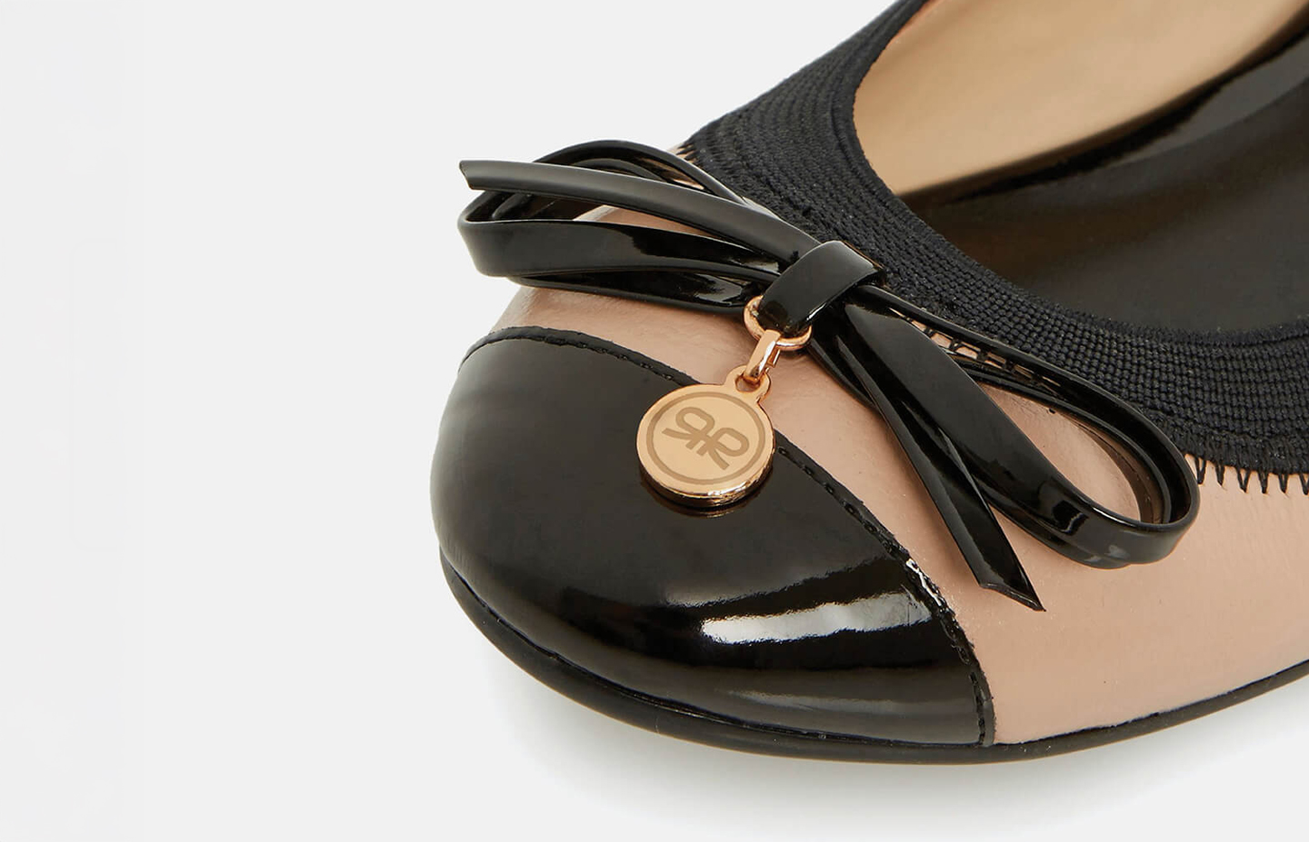
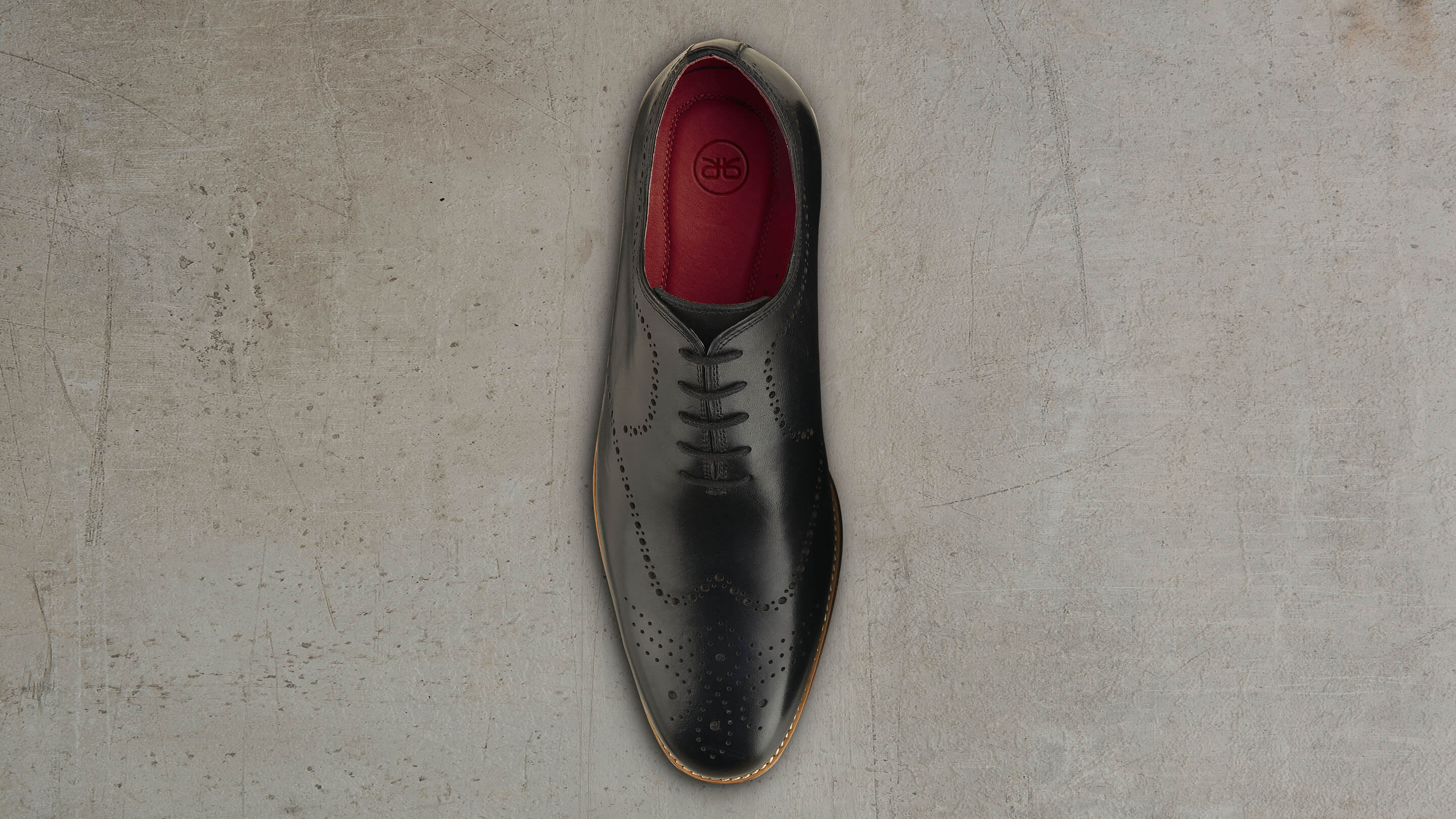
The first task was the logo. We took the original Regal typeface and gave it a thoroughly modern edge with a custom-designed font — familiar enough to carry the brand's heritage, sharp enough to signal its new direction. But the defining move was the emblem: an iconic monogram that encoded the letter R and, within it, a shoelace bow. It was the brand's own intrinsic business, rendered as a fashion device. That emblem became the engine of the entire identity — flexible enough for livery applications across retail, packaging and communication, authoritative enough to make the brand behave like a genuine fashion house.
Regal Shoes — Brand Identity
02
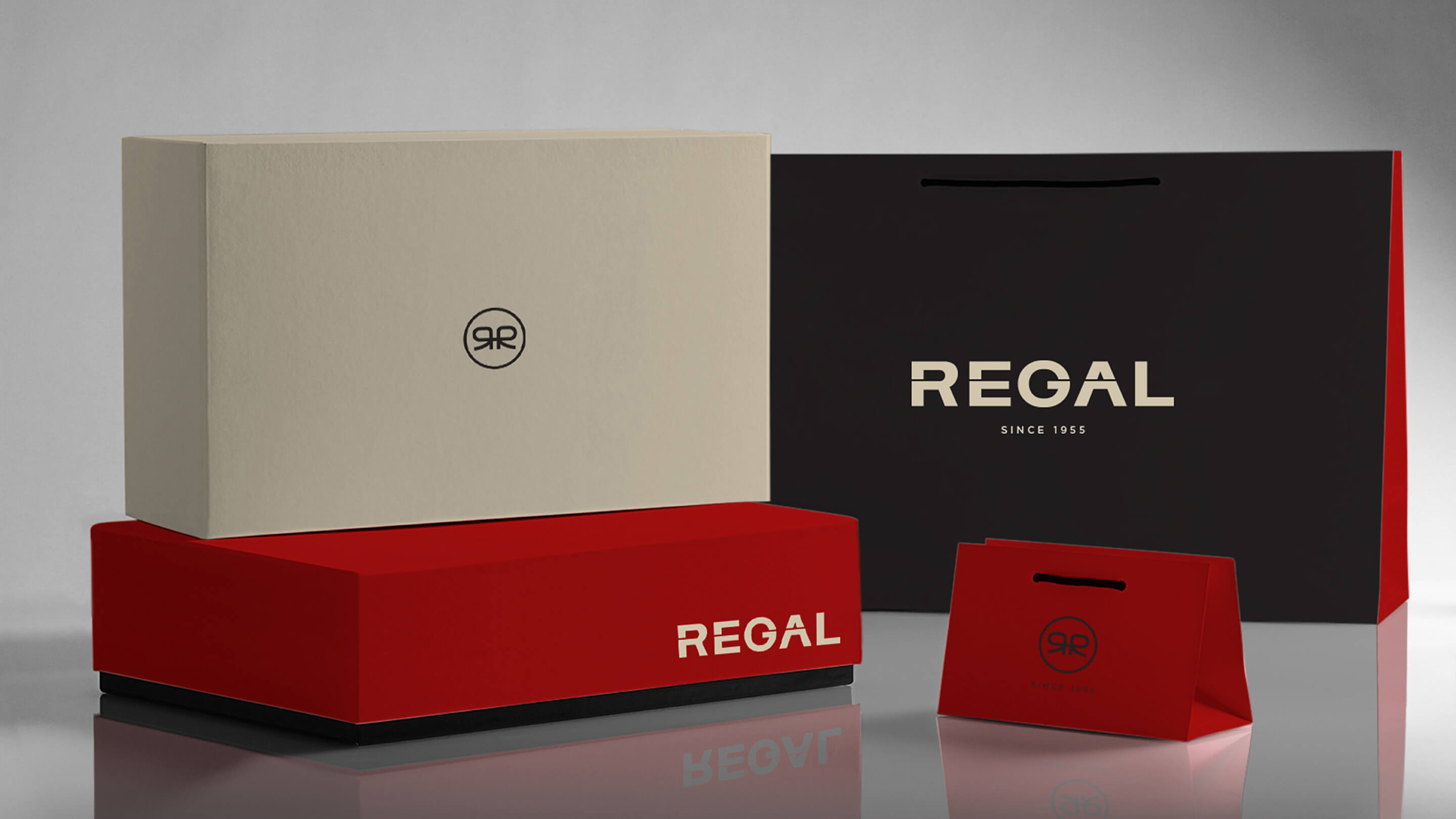
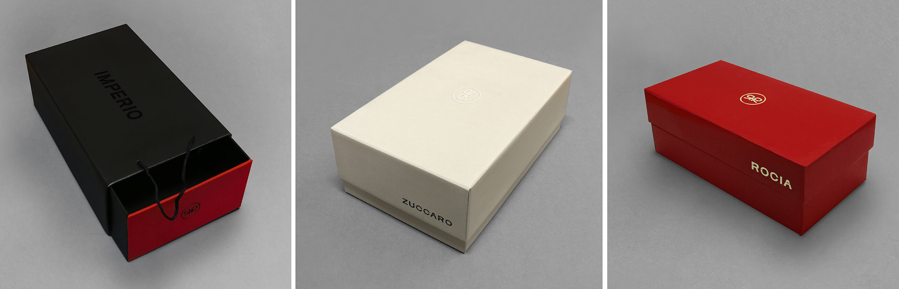
One emblem. Three sub-brands. A packaging architecture that segregates without fragmenting — every box a member of the same family.
The packaging system solved a brand architecture problem: Regal had a mother brand sitting above three distinct sub-brands, each with its own positioning and consumer. The challenge was to give each sub-brand enough visual distinction to own its shelf space, while keeping all four unmistakably Regal. The emblem made this achievable — used consistently across all formats, it anchored the family. The bespoke typeface, applied to each sub-brand name, ensured tonal consistency. Colour palette did the work of differentiation. The result was a packaging system that communicated hierarchy and unity simultaneously, at every price point.
Regal Shoes — Packaging Architecture
03
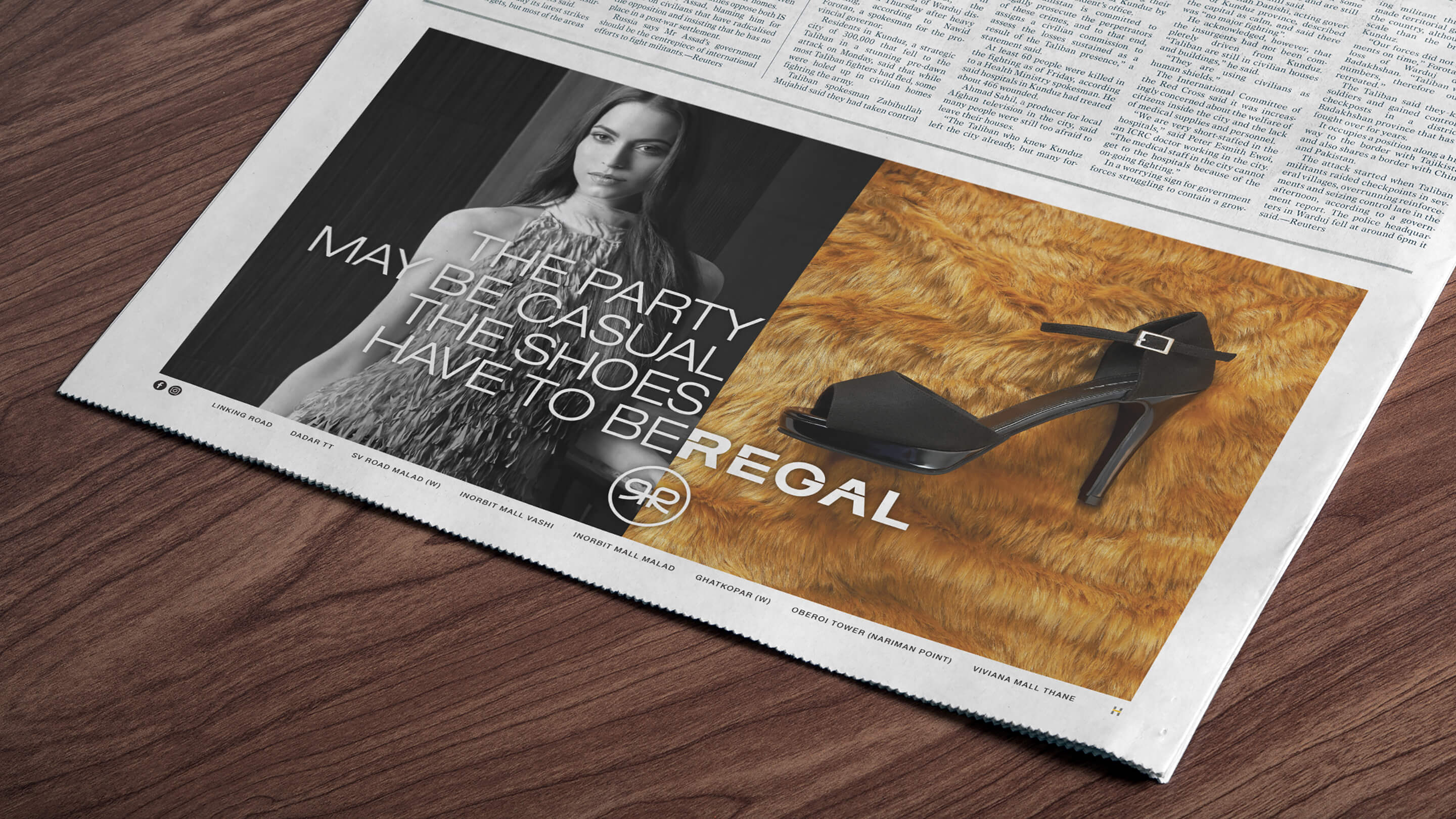
'What's your excuse?' — turning the End of Season Sale on its head by validating the consumer's guilt rather than amplifying the discount.
End of Season Sale communication in fashion is a tightrope: go too hard on the price and you cheapen the brand; ignore the discount and no one comes. We turned the problem inside out. Instead of shouting the offer, we addressed the consumer's internal conflict — the familiar guilt of buying something you didn't strictly need. The 'What's your excuse?' campaign gave them permission to indulge, with wit and warmth, while keeping the product front and centre. It was sale communication that felt like fashion communication. The consumer felt seen, not sold to.
Regal Shoes — Campaign Work
04
From #feelRegal in-store to a vintage scooter in Italy — every season, a new creative world built around the same brand truth.
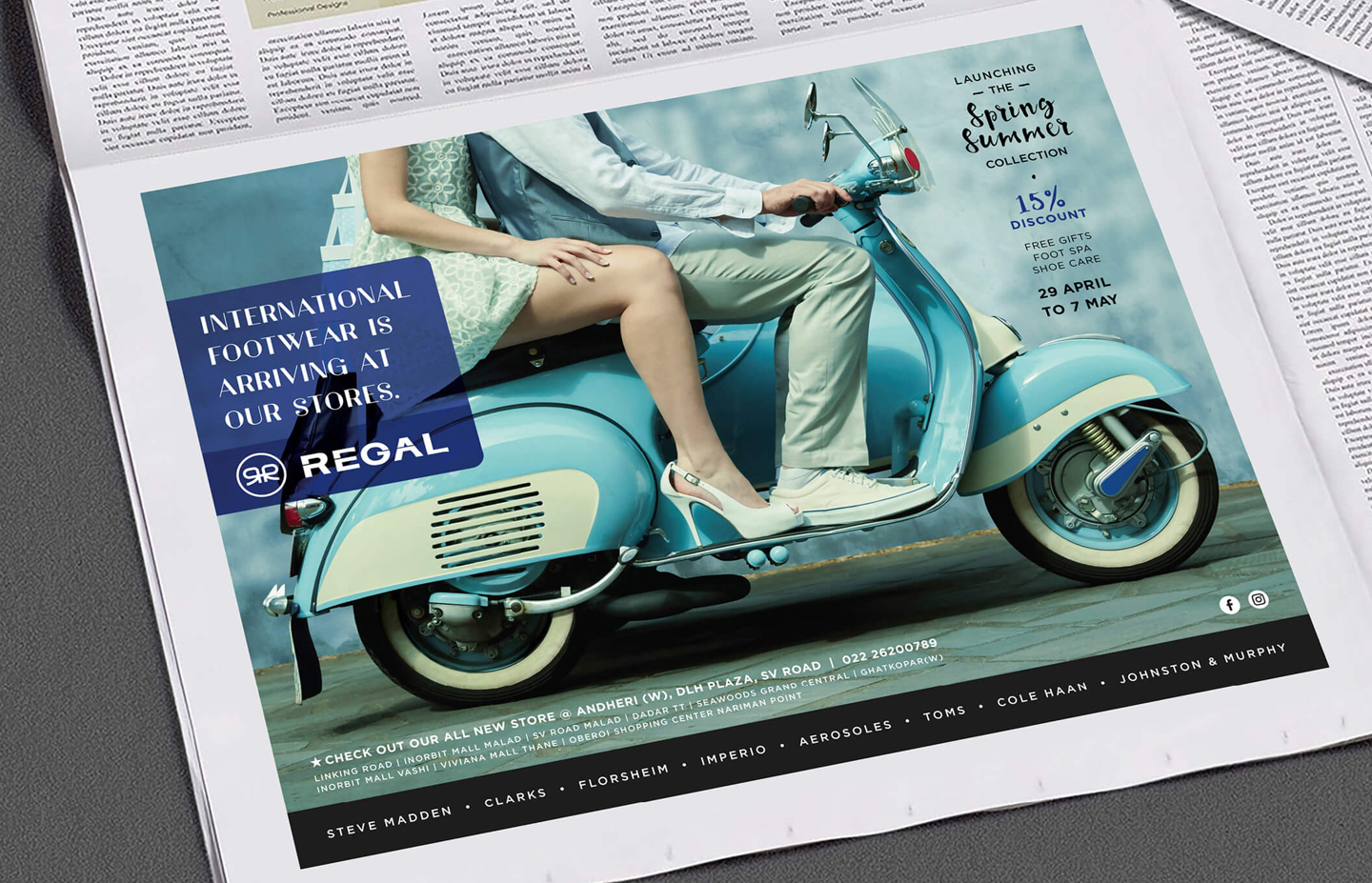
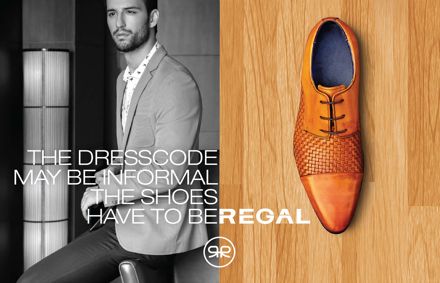
The seasonal communication programme gave Regal the breadth of a genuine fashion brand. Spring/Summer was built around the romance of travel — a vintage scooter on Italian streets, footwear as the hero of a journey — speaking to the Indian consumer's travel season with aspirational precision. Autumn/Winter leveraged the pun in the brand name itself, pairing black-and-white fashion photography with vibrant product shots and the proposition that Regal has a pair for every occasion. Monthly in-store activations anchored around #feelRegal — a clever double on the brand name and the experience of being pampered in-store. And for digital, a simple gif cycling through shoe styles against iconic floors from around the world made the global relevance of the brand instantly legible.
Regal Shoes — Campaign

Regal Footwear came to Hyphen with a clear-eyed brief and a significant ambition: take a brand with genuine heritage and consumer trust, and transform it into something a fashion-conscious shopper would actively choose rather than merely default to. The transition from shoe store to fashion destination is one of the most demanding repositioning exercises in retail — it requires every touchpoint to shift simultaneously, from the logo on the bag to the copy on the hoarding.

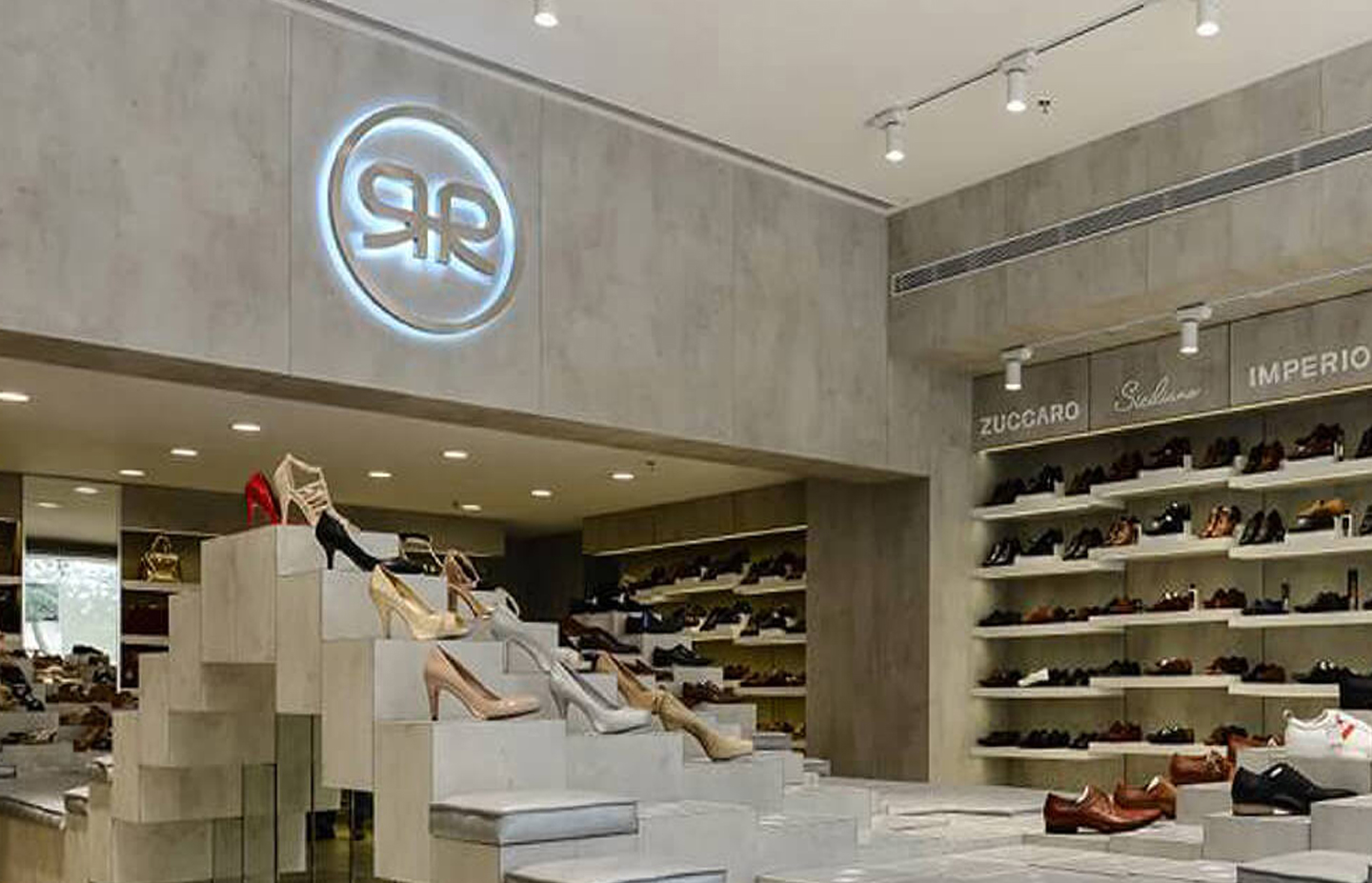
The identity work began with the logo. We developed a bespoke typeface that took the original Regal letterforms and recut them with a contemporary edge — keeping enough of the original to protect the equity, sharpening enough to signal the change. The defining addition was the emblem: a monogram that encoded both the letter R and a shoelace bow, embedding the brand's core business into its own symbol. This was not a decorative device. It was a strategic one — flexible enough to work across every application from shoe box to storefront, authoritative enough to give the brand the visual vocabulary of a fashion house.

The packaging system extended the identity into a full brand architecture. Regal had a mother brand and three sub-brands, each addressing a distinct consumer and price point. The challenge was coherence without sameness — the system had to make each sub-brand legible while making all four unmistakably Regal. The emblem anchored the family across every format. The bespoke typeface applied consistently to each name. Colour palette differentiated the tiers. The result was a packaging architecture that communicated both the richness of the brand family and the unity of the brand language, simultaneously.

The campaign work gave the repositioned brand its voice across the year. The End of Season Sale brief — always a creative challenge in fashion retail — became the 'What's your excuse?' campaign, which addressed the consumer's internal guilt about indulgent purchases with wit and warmth rather than discount pressure. The campaign made the consumer feel understood, not sold to, while keeping the products as desirable as ever.

Spring/Summer was built around travel — the season when Indian consumers most actively seek new footwear — with the visual world of vintage Italy and the romantic notion of a scooter journey giving the campaign an aspirational lightness that felt genuinely fashion-forward. Autumn/Winter used the pun in the Regal name itself, pairing high-contrast fashion photography with vibrant product shots to communicate versatility across every occasion the consumer might need to look their best.

The monthly in-store activation programme, built around the hashtag #feelRegal, created a consistent consumer engagement rhythm that reinforced the brand's shift from transactional retailer to fashion destination. Every piece of communication — from the gif cycling Regal shoes against iconic floors of the world to the seasonal campaigns — worked together to make the same point: Regal is the fashionable footwear choice, wherever you are going.

Next Project
Pehle Aap
Ready to build an
extraordinary brand?
Brief Us →