Raymond Consumer Care came to Hyphen at a moment of acute market opportunity and acute time pressure. Lockdown had been announced. The ground rules of pandemic living — sanitation, surface safety, the constant vigilance of a clean home — were becoming daily realities for every Indian household. Raymond saw the opening for a specialised floor sanitiser product and moved quickly. Our task was to build the entire brand from the ground up: name it, design it, pack it, and launch it into a market that had not existed six months earlier.
The nomenclature brief was the foundation of everything else. In FMCG, the name is not just marketing — it is strategy. A well-constructed name reduces the work the packaging has to do, accelerates shelf recognition, and provides legal protection against the copycat launches that inevitably follow any successful new product in a high-growth category. The name Florsafe+ was built to satisfy all three requirements. 'Florsafe' encoded the product action directly and memorably — floor, safe, the two words that mattered most to a consumer mopping their house in a pandemic. The '+' carried the promise of enhanced efficacy. The combined result was a name simple enough for immediate comprehension, distinctive enough to be copyrighted, and structured enough to carry a full variant grid.
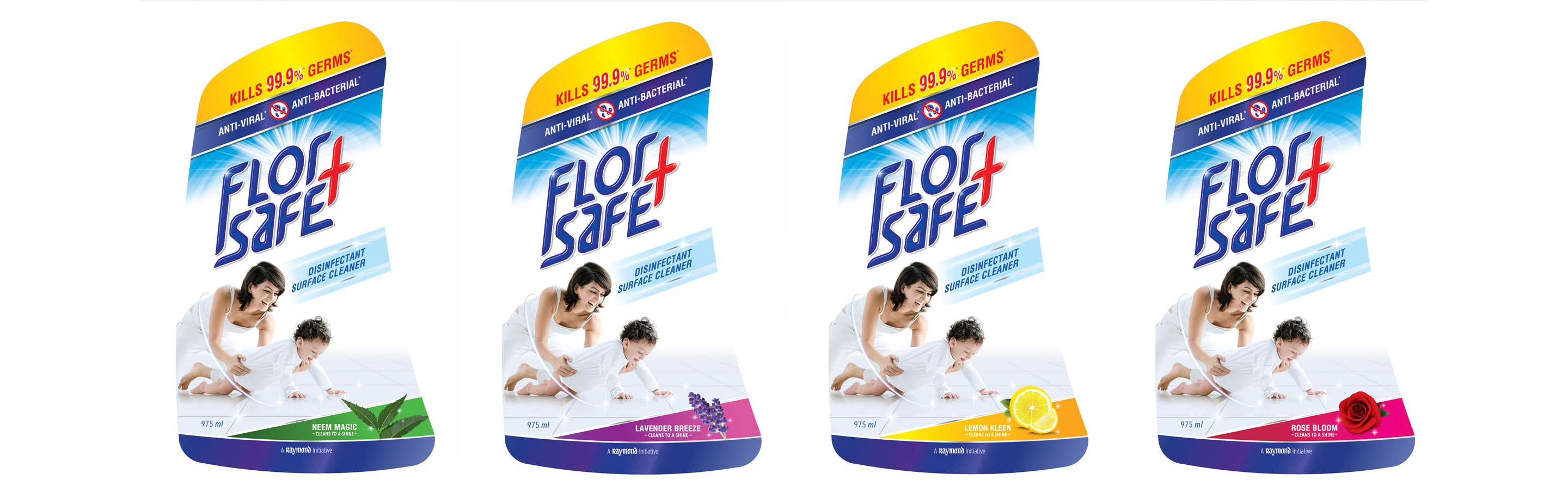
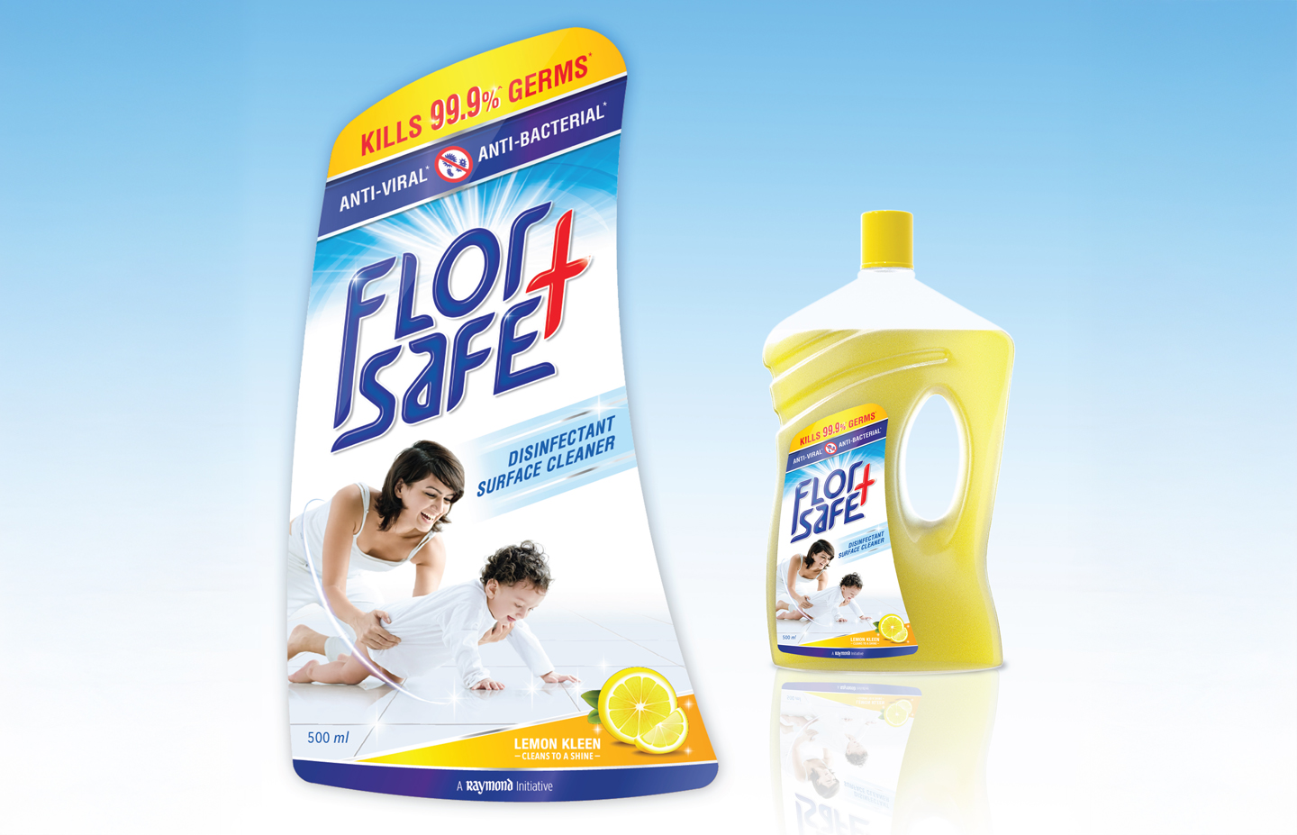
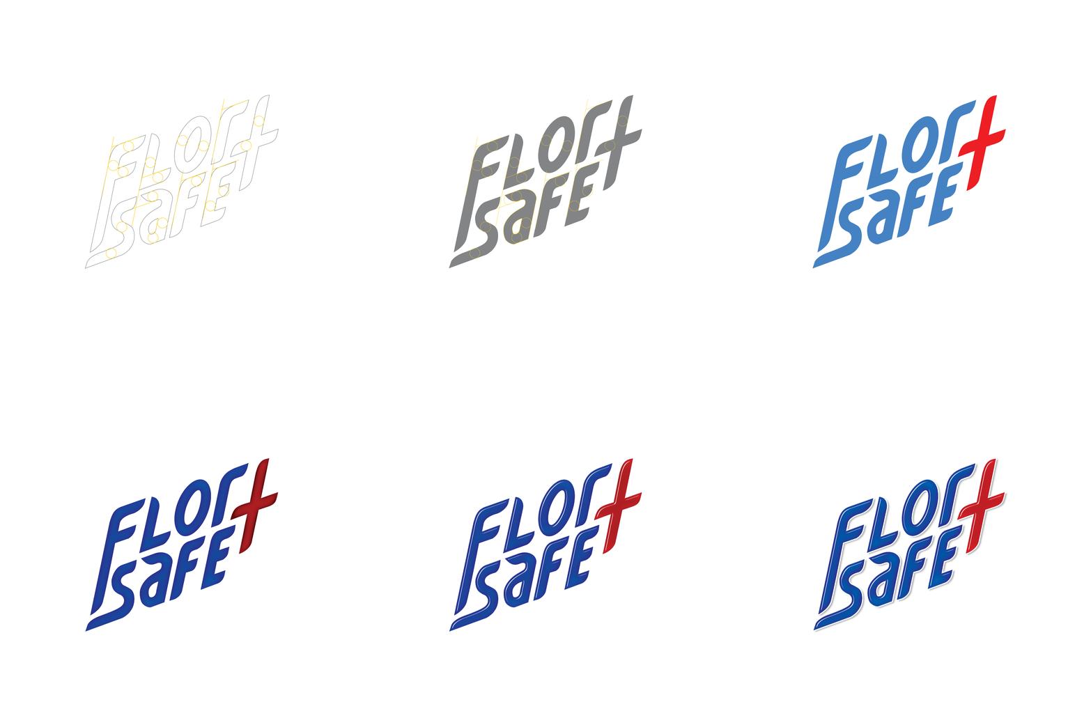
The identity and packaging work began with a custom logotype, designed on a precise grid, that gave the brand a visual presence solid enough to anchor all applications. The letterforms were chosen for impact over elegance — this was a product that needed to communicate seriousness and efficacy before it communicated style. Built on a controlled grid, the logo maintained its weight and legibility at every scale, from a 500ml bottle label to an outdoor campaign.
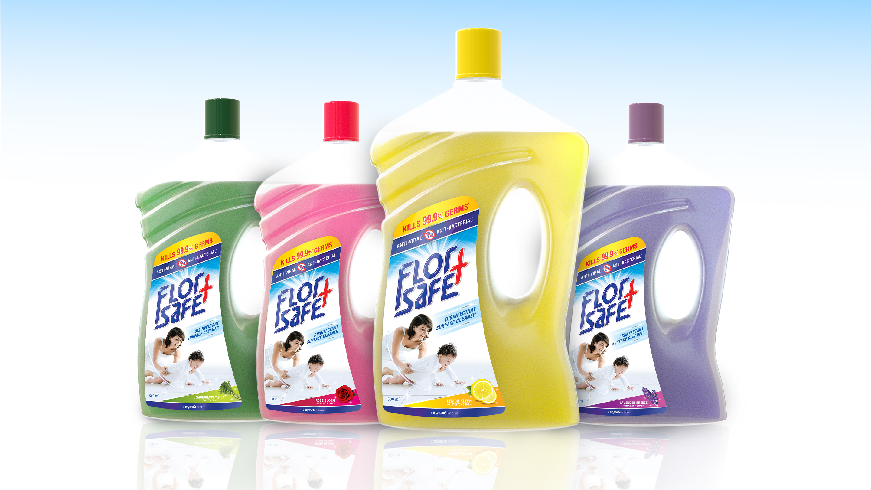
The packaging design process began where all strong packaging begins: with a thorough study of the category. In a sanitation shelf that had expanded dramatically and chaotically during the pandemic, the visual codes of the category were simultaneously overcrowded and inconsistent. The design template for Florsafe+ was built to belong clearly enough that the consumer understood the product category immediately, while being executed with enough distinctiveness that Florsafe+ stood apart from every other option on that shelf. Every square millimetre of every face of the packaging was designated a specific purpose — so that the communication hierarchy was built into the design system itself, not applied as an afterthought. This template was then extended across the full variant and SKU range, ensuring complete coherence across the product family.
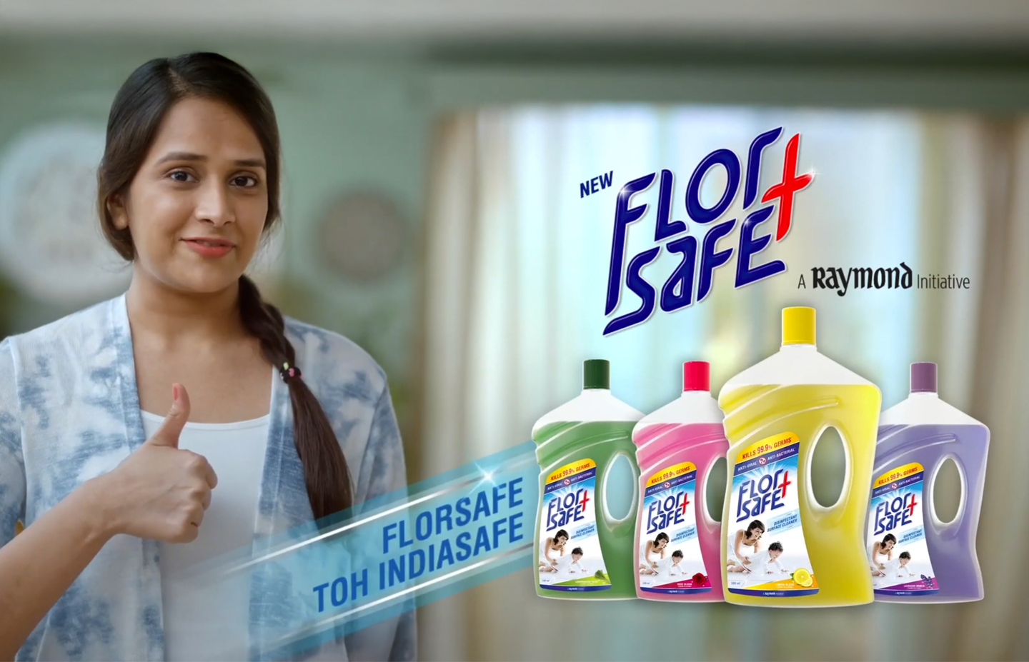
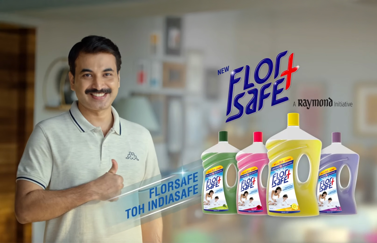
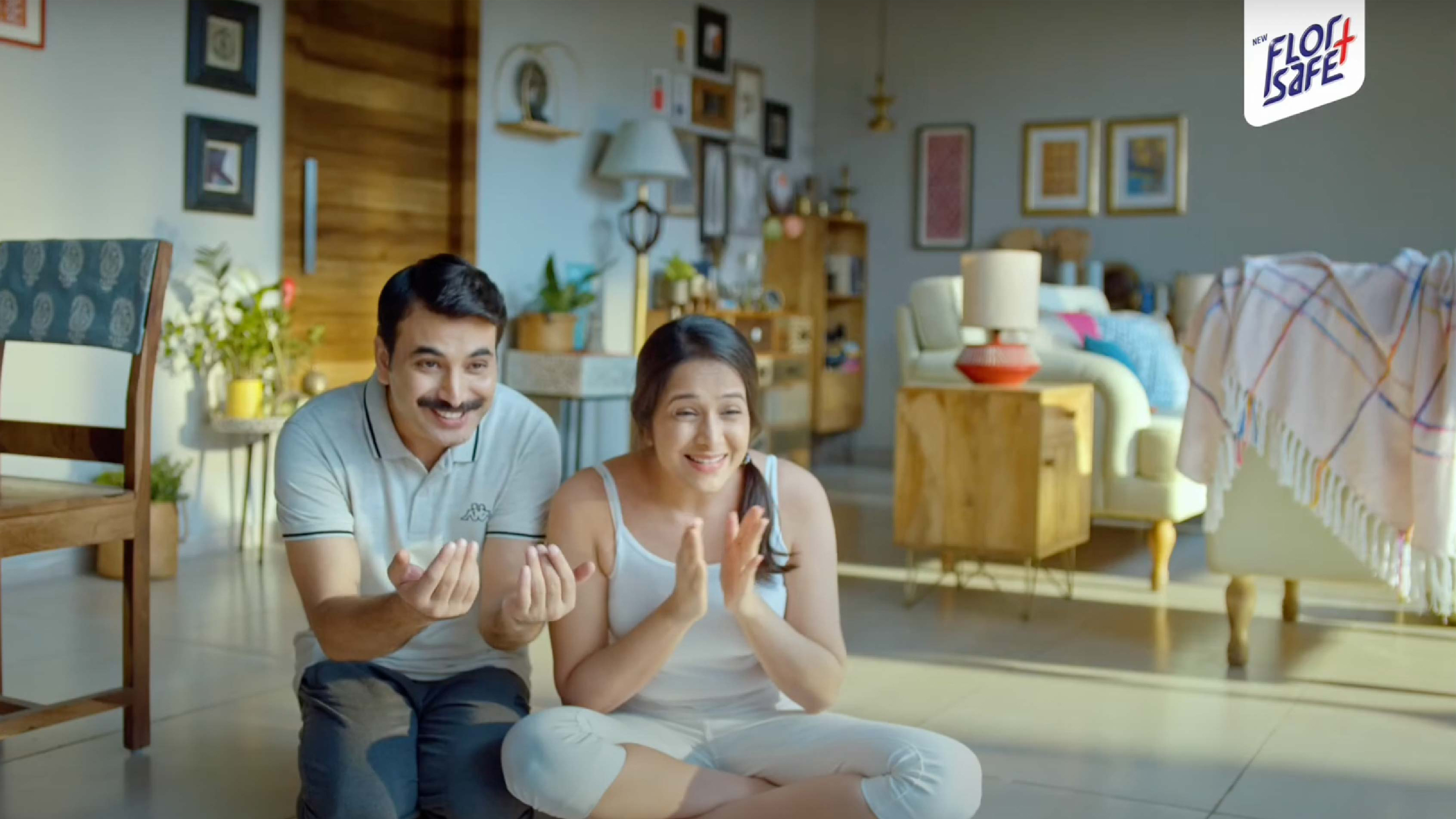
The ATL communication strategy took what could have been a straightforward product launch and turned it into something that spoke to the moment. The pandemic had created a very specific emotional register in Indian consumers — vigilant, anxious, but also determined, collective, resilient. Rather than a rational efficacy message, the Florsafe+ TVC used the product name itself as the creative idea: a clarion call, a national declaration of intent, a collective promise to keep homes safe. The name was repeated and reinforced not as a slogan but as a rallying cry, building both brand recall and consumer reassurance in the same breath. Everything — from the name to the packaging to the TVC — hammered the same single-minded message, at the moment when single-mindedness was exactly what the brand needed.