ABBY Silver + 1
Case Study
Orra
Orra Fine Jewellery
Scroll


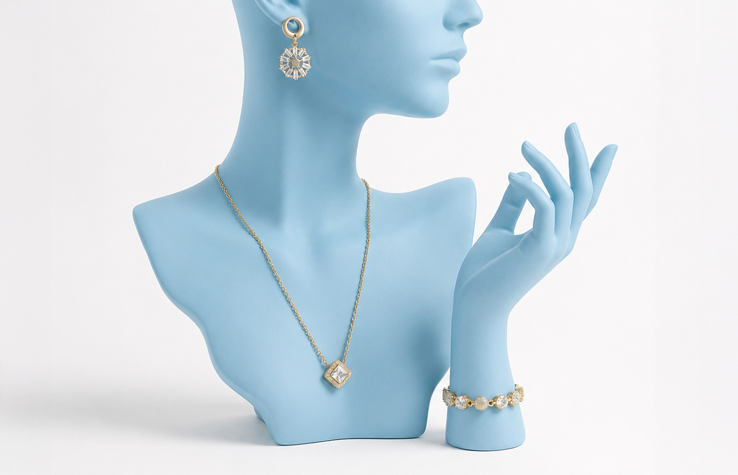
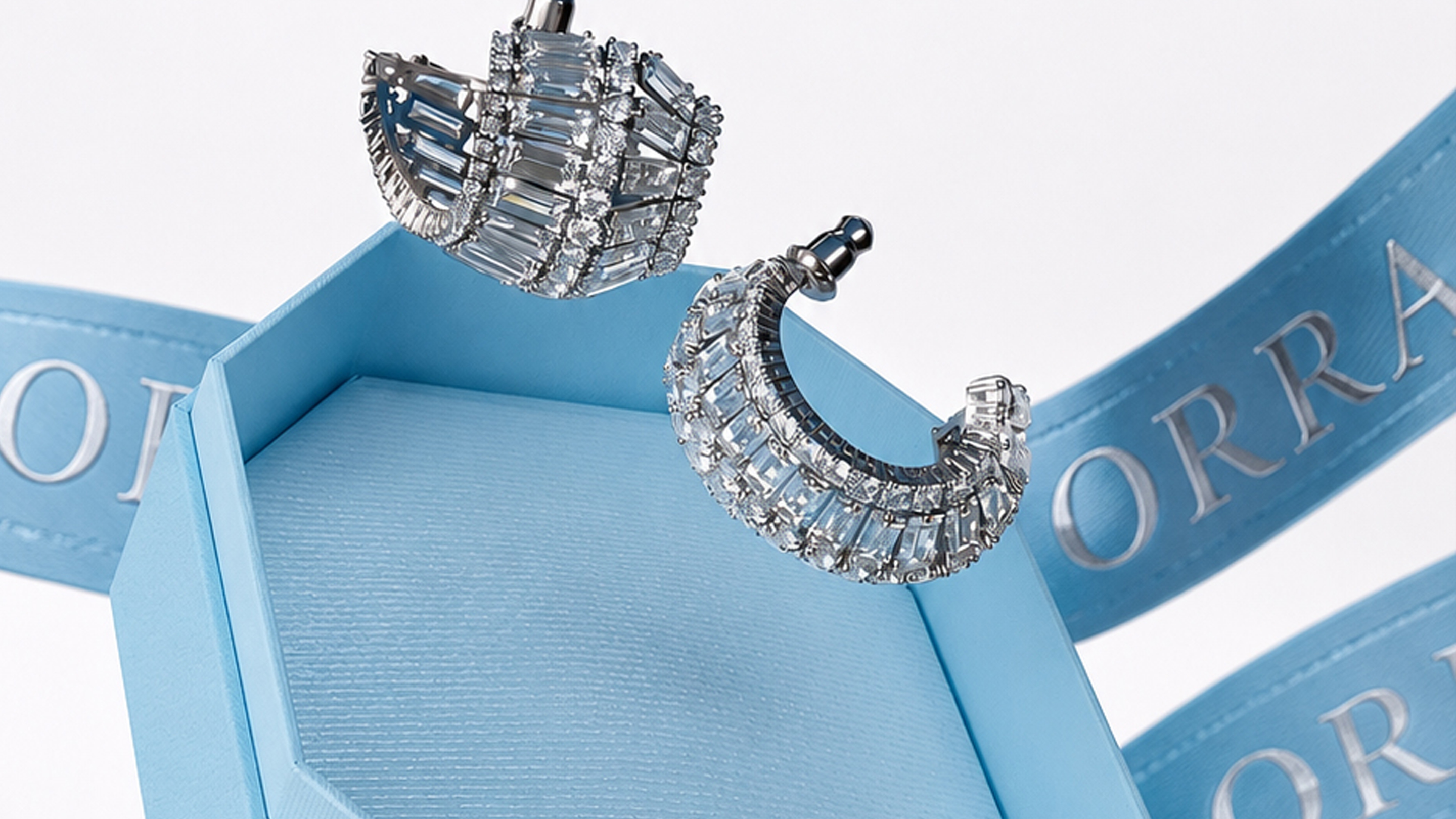
Orra Fine Jewellery came with the kind of brief that requires discipline rather than invention: a brand with genuine heritage — dating back to 1888, backed by the Rosy Blue group, one of the world's leading diamond companies — that needed an identity refresh worthy of its standing. The temptation in luxury jewellery branding is always to add: more gold, more flourish, more visual complexity. The brief demanded the opposite. Great jewellery brands, the ones that endure, are defined by restraint.
The logo solution came from looking at what the brand already had in its name. Two O's, placed together, form the simplified graphic of an engagement ring — the most iconic object in the jewellery world, the quintessential representation of a diamond. The Orra monogram encodes the brand's core business in the most direct way possible, without metaphor or decoration. It is immediately recognisable, immediately appropriate, and immediately flexible — a symbol that could work at the scale of a door handle or a billboard with equal authority.
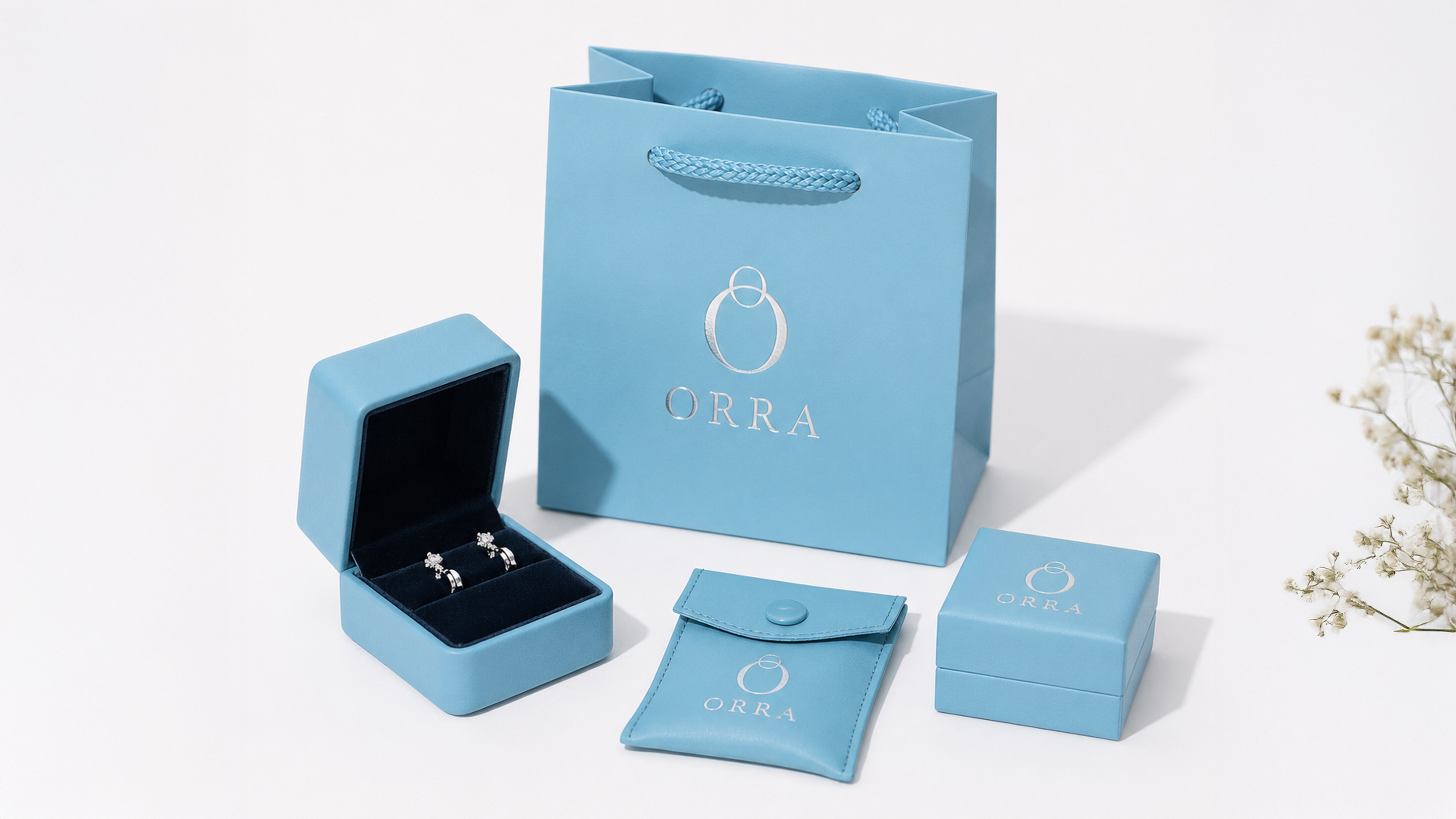
The colour identity was built on sky blue and black — a pairing that was distinctive within a category overwhelmingly dominated by gold and red, and which gave Orra a visual register that felt simultaneously premium and modern. The packaging system deployed the double-O symbol across every box format and material, adapting its application to the surface: full colour on primary packaging, and the more rarefied language of deboss, emboss and blind UV where texture was more appropriate than colour. The consistency of the symbol across all formats created immediate brand recognition at every price point.
The retail environment extended the identity with the same systematic thinking. The monogram, cast in brushed steel, became the door handles of the store — so the brand's first physical impression on every visitor was the symbol itself, held in their hands as they entered. Inside, the legacy wall told the brand's history through trade and historical paraphernalia, with the 'Since 1888' descriptor discreetly present as a statement of lineage rather than a boast. Heritage communicated through objects has a different weight than heritage communicated through copy.
The UHNI tier of the brand received a refined colour treatment — a shift in the palette that elevated the identity to an even more premium register without altering the icon itself. This was an important proof of the system's robustness: the same symbol, in different hands, could address audiences at entirely different ends of the market while remaining unmistakably Orra.
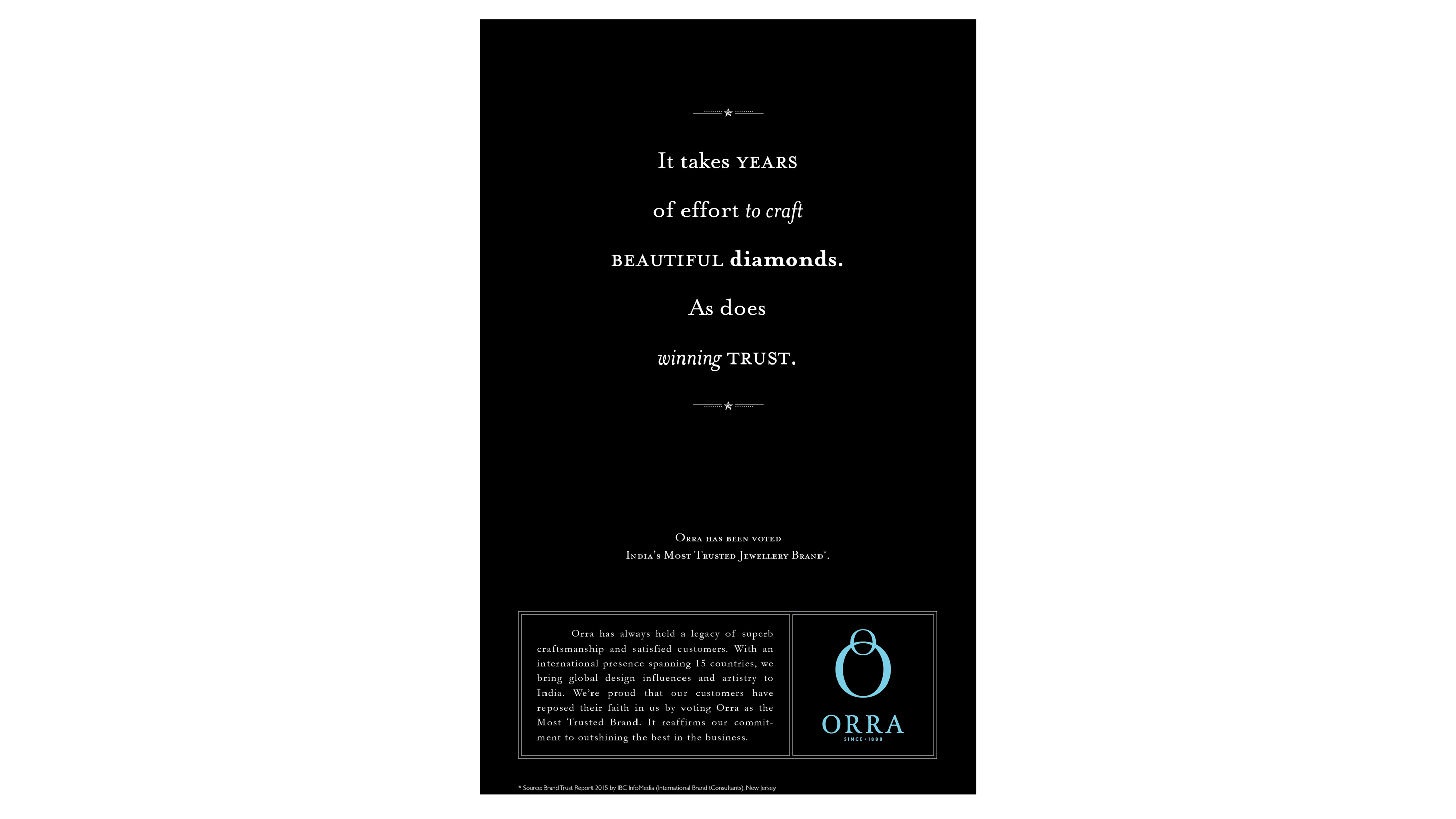
The print campaign for Orra's Brand Trust Award brought the same sensibility to mass communication. Appearing on the front pages of national dailies, the ads used witty copy that spoke in the language of diamonds — hinting at the world of the brand rather than describing it — set against the jewellery itself, photographed with the clean confidence that Orra's identity demanded. In a category that routinely overstates, Orra's print communication was notable for exactly what it chose not to do. The restraint was the message.