be!MYN — Hyphen Brands
Case Study

be!MYN

Myntra Beauty
Scroll

Discipline
Brand Strategy · Identity · Packaging
Client
Myntra
Scope
Naming · Logo · Colour · Packaging · Typography · Digital
The Brief
be!MYN was created for a generation that treats beauty as personal, instinctive and constantly changing — bare and effortless one day, maxxed, glossy, playful or dramatic the next. Not searching for one fixed version of themselves. Comfortable being every version. The brand needed an identity that could hold all of this naturally.
Philosophy
Embrace Every Mood — a brand truth that gave every product, palette and personality a home
Device
The exclamation mark lifted from the logo and turned into the brand's unmistakable visual signature across every touchpoint
Presence
be!MYN entered the category looking like it already belonged there — distinctive, current and instantly recognisable
01
Gen Z grew up rejecting labels. Their beauty brand had to do the same.
The strategic insight was simple and true: Gen Z does not experience beauty in one fixed mood. They move between aesthetics fluidly — no-makeup skin one morning, a full editorial look the same evening. Any brand that tried to pin them to a single identity would lose them before the packaging was opened. The brand philosophy that emerged — Embrace Every Mood — was not a tagline but a structural principle. It shaped everything that followed, from the colour system to the exclamation mark device to the photography direction. The identity had to move as freely as the people it was built for.
be!MYN — Brand Identity
02
We began with pink. But not the predictable beauty-industry pink. This one could feel delicate in one moment and striking in another.
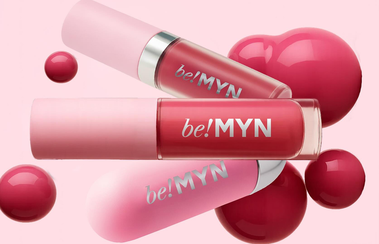
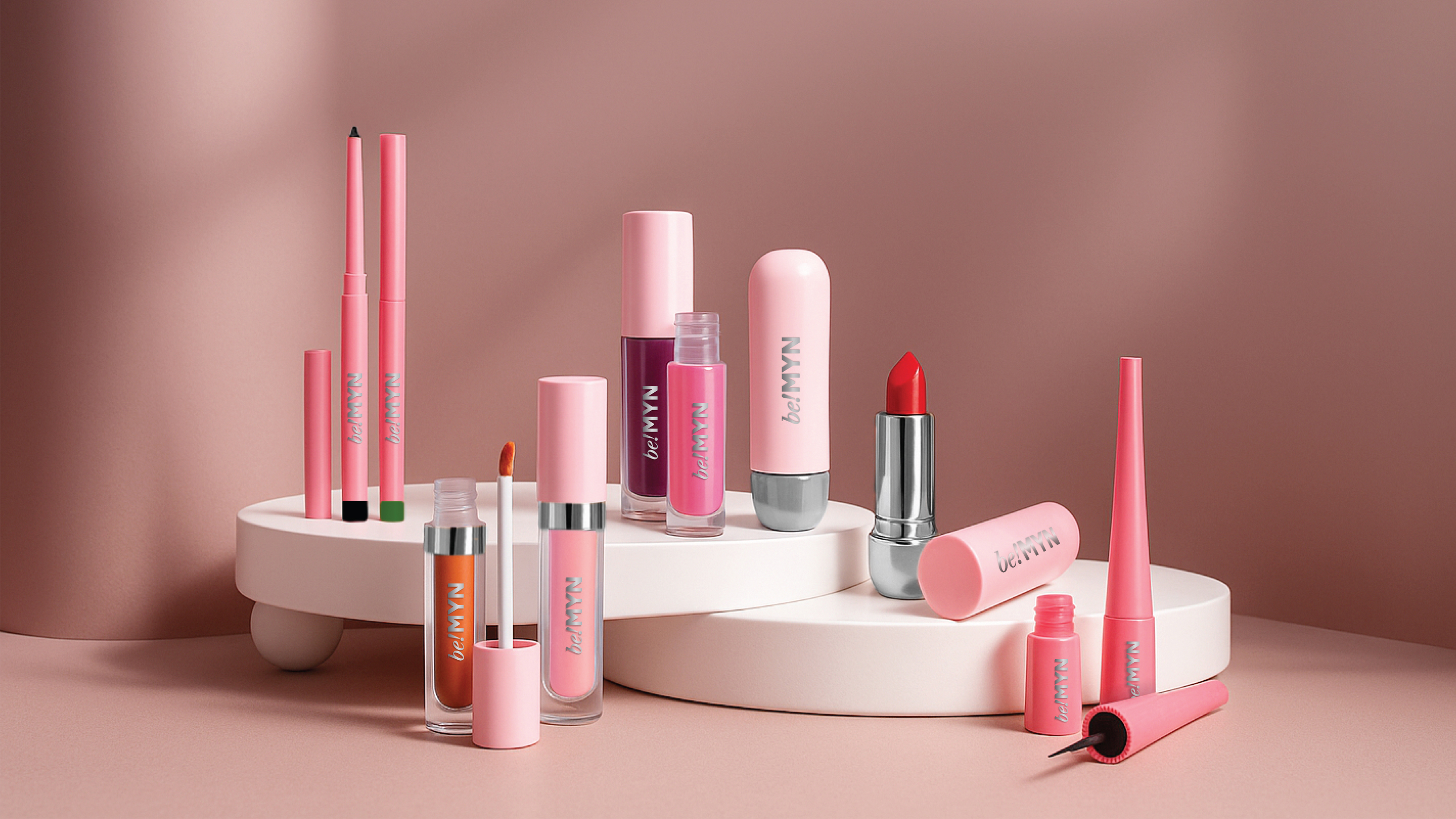
The colour work began with a single decision: pink, but reconsidered. Not the saturated hot pinks of mass beauty retail, nor the blush pastels of luxury skincare. A softer, cooler pink — one with genuine range. It could sit quietly on minimal packaging or hold its own beside silver foiling and bold typography. From that starting point, the palette expanded into different shades of pink across the brand, allowing products and personalities to carry their own character while remaining unmistakably be!MYN. Monochromes and silver accents completed the system, giving the identity a clean, fashion-aware edge that separated it from the beauty category's visual conventions.
be!MYN — Logo & Wordmark
be!MYN — Colour System
03
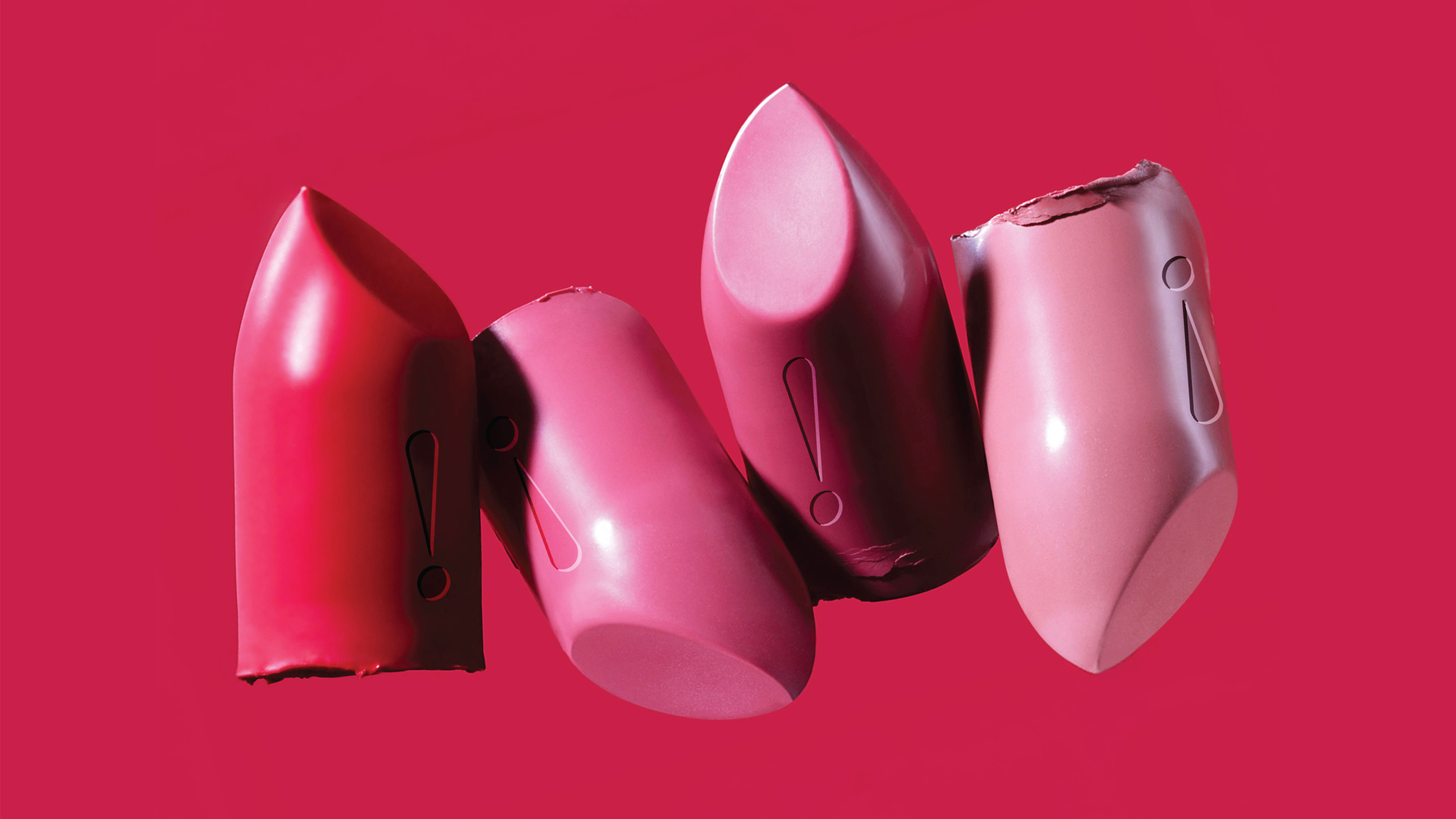
Then came the exclamation mark. We lifted it out of the logo and turned it into a recurring visual device — the brand's own unmistakable signature.
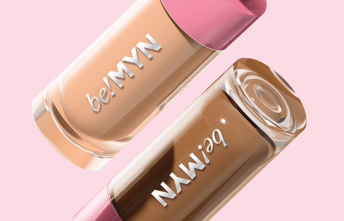
At the centre of the identity sat the wordmark. The serif "be!" brought expression and individuality — the serif weight giving it warmth and character. The bold "MYN" added structure and sharpness. Together they created a mark that felt stylish, youthful and full of personality. But the real creative move was what happened next: the exclamation mark was extracted from the logo and promoted to a visual device in its own right. Sometimes embossed on packaging. Sometimes cropped into a layout. Sometimes reduced into curves, dots and graphic accents. Typography paired Libre Caslon with Montserrat for contrast between expression and clarity. The layouts borrowed from the exclamation mark and letterforms to create a graphic system that travelled seamlessly across every touchpoint.
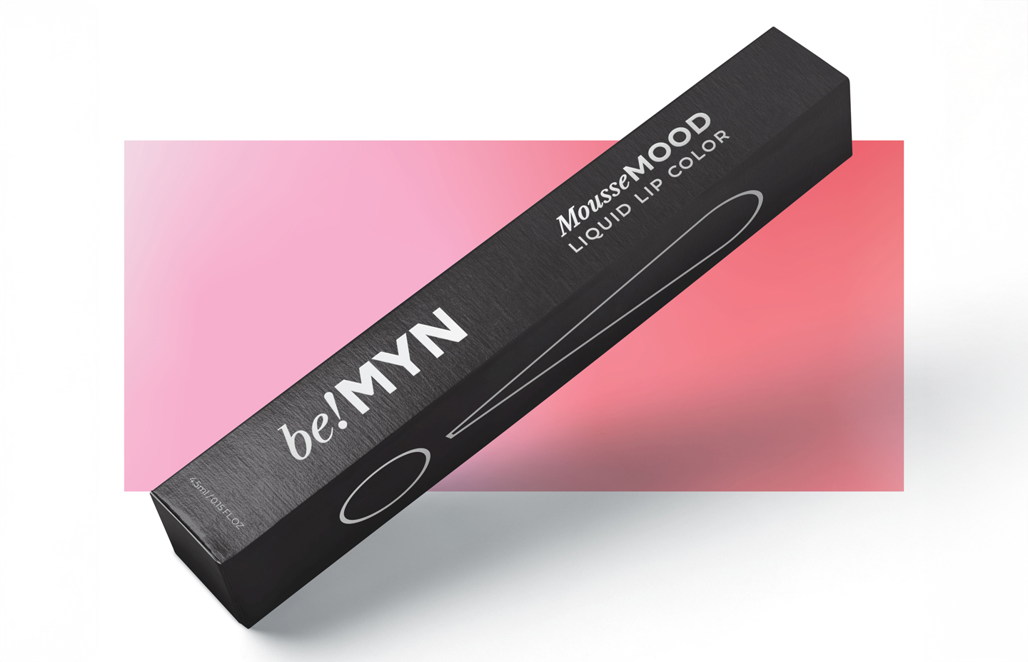
be!MYN — Packaging
be!MYN — Exclamation Mark Device
be!MYN — Brand Applications
04
More than a logo, a visual language Gen Z could instantly relate to — across packaging, stickers, accessories, merchandise and digital communication.
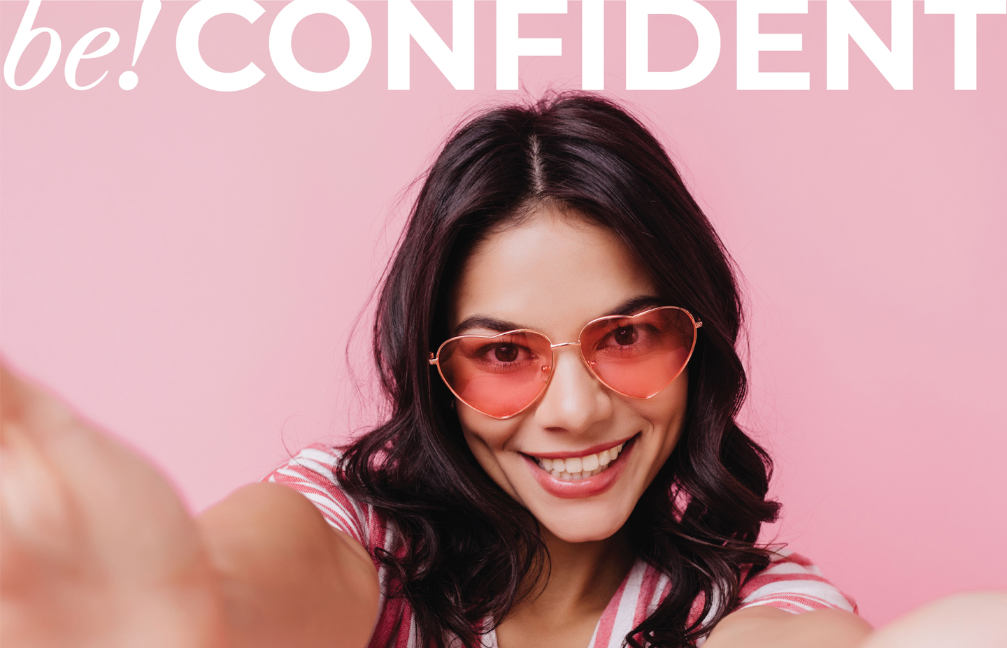
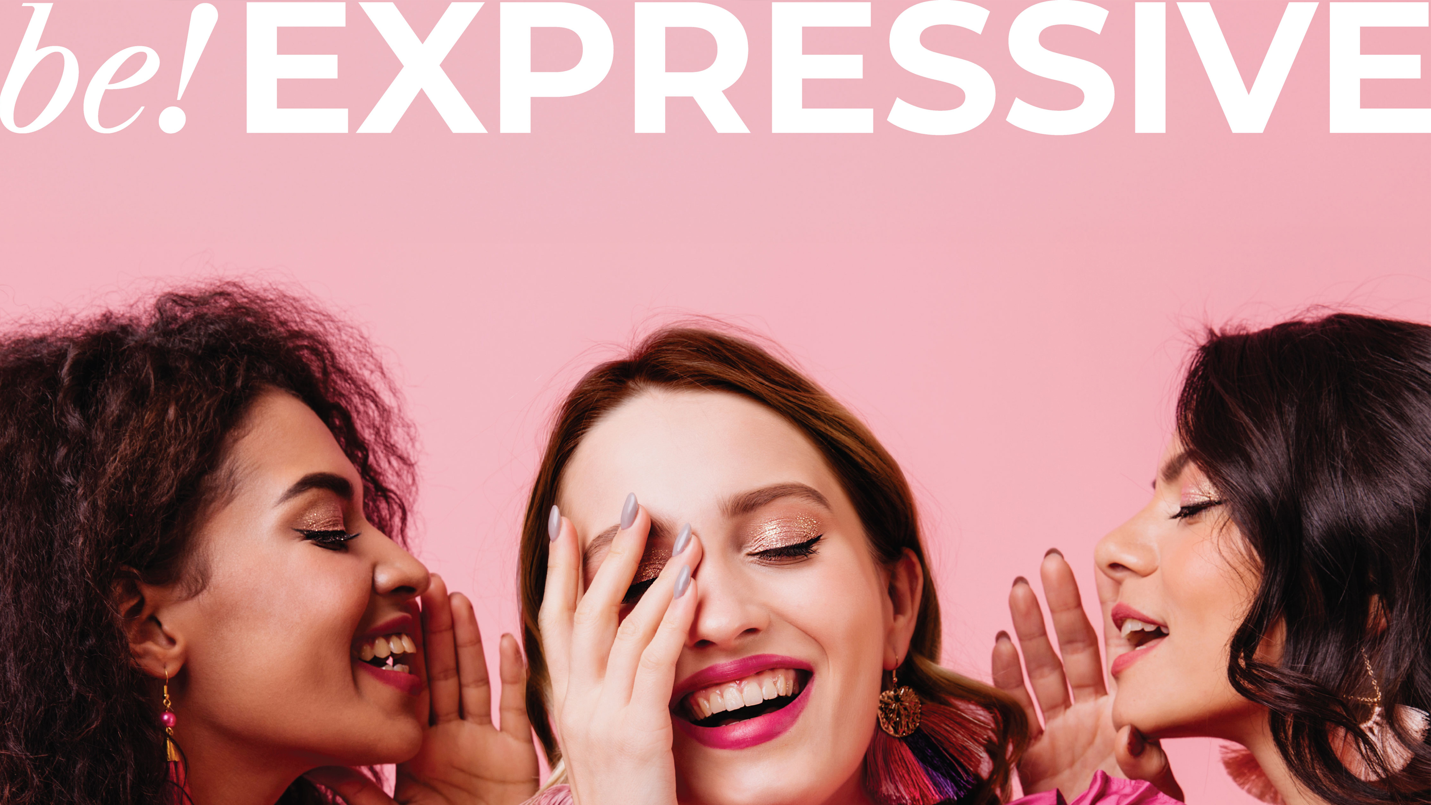
The photography direction stayed deliberately away from the overly staged beauty advertising that Gen Z has learned to scroll past. Skin looked real. Expressions felt natural. The imagery carried the individuality and emotional honesty that this generation connects with instinctively — not aspirational distance but felt recognition. The identity was extended across packaging, stickers, accessories, merchandise and digital communication, creating a brand experience that felt cohesive at every level. From packaging to social communication, the identity gave be!MYN a distinctive and instantly recognisable presence — every detail, from the evolving shades of pink to the exclamation mark device, working together to create a beauty brand as expressive and fluid as the people it was made for.
be!MYN — Campaign & Digital

be!MYN arrived as a brief from Myntra with a specific audience and a specific problem. The audience was Gen Z — a generation that had grown up rejecting fixed identities, moving between aesthetics with complete comfort, treating beauty as a form of daily self-expression rather than a fixed standard to achieve. The problem was that most beauty brands, even those positioning themselves as youthful, still operated on the premise of a single aesthetic: one mood, one look, one version of beauty that the consumer was invited to aspire to. be!MYN needed to do something structurally different.

The brand philosophy that emerged was Embrace Every Mood. This was not a creative tagline applied over a conventional brand identity — it was the organising principle from which every design decision flowed. If the brand was genuinely built around mood fluidity, then the colour system had to be fluid. The logo had to carry multiple registers simultaneously. The photography could not be staged into a single aesthetic. The packaging had to flex across products and personalities without losing coherence. Every element had to work the way Gen Z's own relationship with beauty worked: with range, naturalness and the confidence to change.

The colour work began with pink — but a specific pink. Not the hot saturated pinks of mass beauty retail, not the powdery blush of luxury skincare. A softer, cooler pink with genuine range: delicate on minimal packaging, striking beside silver foiling. From that foundation, the palette expanded into a family of pinks, each carrying its own character while remaining unmistakably part of the be!MYN world. Monochromes and silver accents gave the system a fashion-aware edge, separating it from the beauty category's visual conventions.

The wordmark was built from two deliberate contrasts. The serif "be!" brought expression and warmth — the weight and character of a serif letterform softening the mark and giving it personality. The bold "MYN" brought structure and sharpness. Together they held the brand's central tension: individuality and belonging, softness and confidence, personal and collective. The exclamation mark that connected them became the brand's most important single element when it was extracted from the logo and given a life of its own: embossed on packaging, cropped into layouts, reduced into curves and dots that appeared as graphic accents across the entire system.

Typography paired Libre Caslon with Montserrat — the contrast between a classic, expressive serif and a clean, precise sans-serif mirroring the brand's core tension between mood and structure. Photography was directed away from the highly produced, aspirationally distant imagery that characterises most beauty advertising, toward images where skin looked real, expressions felt natural, and the people in front of the camera seemed to be living rather than performing. The layouts borrowed their graphic logic from the exclamation mark and the letterforms of the wordmark, creating a visual system that could travel across packaging, digital, stickers, accessories and merchandise with complete coherence.

be!MYN launched into a crowded category and immediately looked like it belonged — not because it imitated what was already there, but because it had its own clear visual logic, its own signature device, and a brand philosophy that was genuinely specific to the generation it was built for.

Next Project
Taj Tea House
Ready to build an
extraordinary brand?
Brief Us →